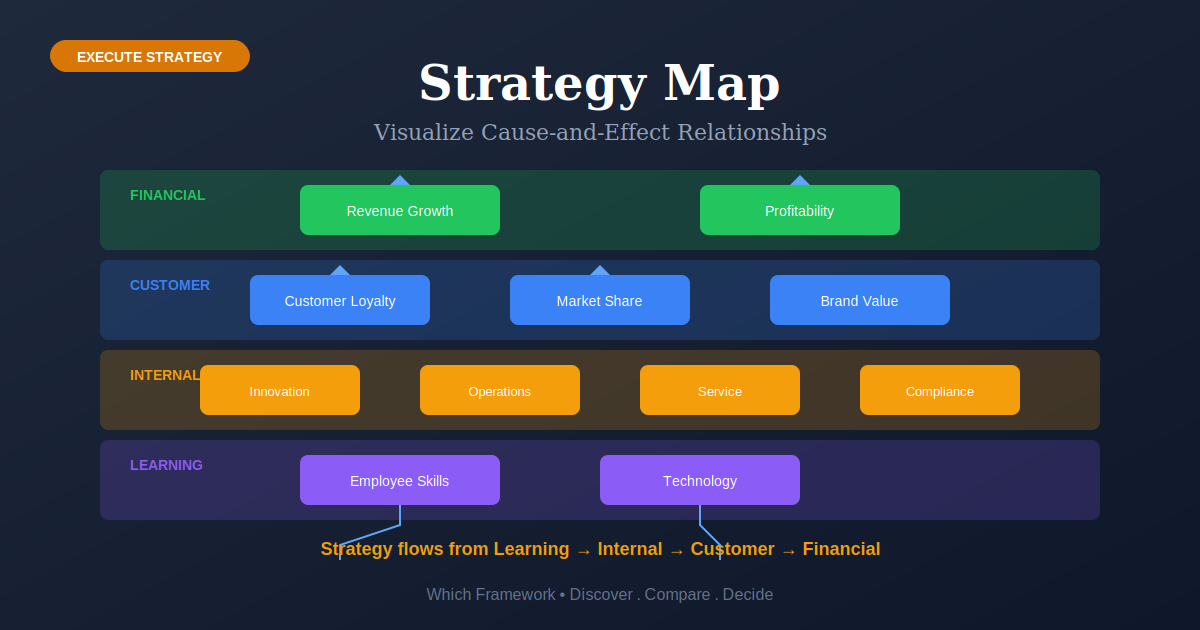
Strategy Map: Visualize Cause-and-Effect Relationships
Strategy Map is a visual representation of strategy that shows how strategic objectives connect through cause-and-effect relationships across four perspectives, making the "story" of strategy visible and understandable.
Before you start
Is a strategy map your framework?
A strategy map does one thing: it draws the cause-and-effect chain by which your strategy is supposed to work, on a single page, across four perspectives. Objectives connect upward with arrows, and each arrow is a claim you are making about how the business functions.
Its value is not the diagram. It is that drawing the arrows forces a leadership team to state a causal argument they usually leave implicit — and to discover, often for the first time, that they disagree about it.
| If your real problem is… | You probably want |
|---|---|
| We need measures, targets and initiatives, not a diagram | Balanced Scorecard — the map’s companion. The map shows the logic; the scorecard measures it. Compare Map and Scorecard |
| We have not decided what the strategy is yet | SWOT, Five Forces or PESTEL — a map draws a strategy, it cannot choose one Compare all three |
| We need focus and momentum this quarter | OKR — lighter, faster, and far less machinery Not sure which? Compare |
| We need to map how work actually flows through the business | Value Stream Mapping — a process map, not a strategy map. Different object entirely. |
| We need to show numbers to people clearly | Dashboarding — presentation, not causal logic |
| Turning a chosen strategy into what teams actually do | The strategy execution playbook, where the strategy map is stage 1 of 5 |
| We have a strategy and cannot explain how it is meant to work | Strategy map — you are in the right place |
Strategy map or Balanced Scorecard?
They are two halves of the same method and are constantly confused. The strategy map is the diagram of objectives and the arrows between them. The Balanced Scorecard is the accompanying table of measures, targets and initiatives. Kaplan and Norton published the scorecard first, in 1992, and added the map eight years later — because organizations kept producing scorecards full of measures with no stated logic connecting them.
What Is It?
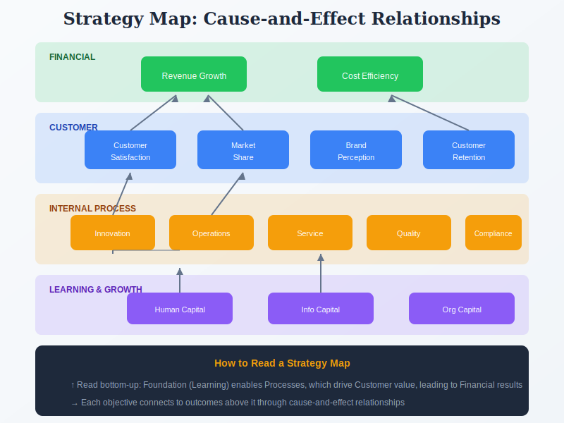
The Strategy Map, developed by Robert Kaplan and David Norton as a companion to the Balanced Scorecard, is a one-page visual diagram that tells the story of how an organization creates value. It shows strategic objectives organized in four horizontal layers and the cause-and-effect relationships between them.
Reading from bottom to top: Learning & Growth (employee capabilities, technology, culture) enables better Internal Processes (operations, innovation, service), which delivers superior Customer value propositions, which ultimately drives Financial outcomes for shareholders.
The power of Strategy Maps lies in making implicit strategic assumptions explicit. When you draw the lines connecting objectives, you're creating testable hypotheses: "If we invest in employee training, our process quality will improve, which will increase customer satisfaction, which will grow revenue."
Strategy Maps transform strategy from an abstract document into a visual tool that enables communication, alignment, and execution throughout the organization.
Quick Reference
The core mechanism
The cause-and-effect linkages
A strategy map is read from the bottom up, and that direction is the entire argument. Each layer is supposed to enable the one above it, so an arrow drawn between two objectives is a testable claim rather than a decoration.
| Layer | What it holds | The claim the arrow upward makes |
|---|---|---|
| Learning & Growth (bottom) | People, skills, systems, culture, data | “If we build this capability, our internal processes will improve.” Everything above depends on this layer, and it is the one usually filled with training-hour counts. |
| Internal Process | The few processes that carry the strategy | “If these processes improve, customers will notice a difference.” |
| Customer | Value proposition, satisfaction, retention, share | “If customers experience that, they will buy more, stay longer, or pay more.” |
| Financial (top) | Revenue growth, margin, return, cash | The outcome. Nothing points upward from here — financial results are where the chain ends, which is why they cannot be managed directly. |
Three rules make the arrows mean something:
- Every objective needs at least one arrow in or out. An unconnected objective is not part of the strategy, whatever else it may be.
- Arrows cross perspectives, not just within them. A map whose arrows stay inside one layer has not made a causal argument.
- Each arrow should be falsifiable. You should be able to say what you would observe, and roughly when, if the link held — and what you would observe if it did not.
The honest status of those arrows
They are hypotheses, not mechanisms. Kaplan and Norton themselves describe a strategy map as making explicit a series of hypotheses about cause and effect, and the academic critique of the Balanced Scorecard turns on exactly this point — that the relationships are asserted rather than demonstrated, with time lags unaddressed. That is a reason to treat your map as a claim you are testing, not a reason to skip it. A stated hypothesis can be proved wrong, which is more than an unstated one offers.
Core Features
- Four Perspectives: Financial, Customer, Internal Process, Learning & Growth (same as Balanced Scorecard)
- Cause-and-Effect Arrows: Visual connections showing how objectives drive outcomes
- Strategic Objectives: 15-25 key objectives that describe the strategy
- One-Page Format: Entire strategy visible at a glance
- Value Creation Story: Reads as a narrative from foundation to outcomes
- Testable Hypotheses: Each linkage is an assumption that can be validated
Worked example
One chain, four layers, four arrows
An illustrative composite. A Seattle-based equipment rental business with 40 branches, whose strategy was to win contractor accounts from national competitors on reliability rather than price. The first map had 31 objectives and no arrows. The second had 12 and a chain you could argue with.
| Layer | Objective | The arrow upward asserts… | Test |
|---|---|---|---|
| Learning & Growth | Branch staff certified to authorize same-day swaps without regional approval | …that removing the approval step will cut equipment downtime for customers | % of branches with two or more certified staff |
| Internal Process | Replacement equipment on site within 4 hours of a fault report | …that faster recovery is what contractors actually value | Median hours from fault report to working equipment |
| Customer | Contractors rate us more reliable than the national alternative | …that perceived reliability drives contract renewal and share of wallet | Renewal rate, and share of each account’s fleet |
| Financial | Revenue per contractor account up 15% | Outcome — nothing points up from here | Revenue per account, year over year |
What the arrows exposed
The bottom objective is the one that mattered, and it did not exist in the first draft. The original Learning & Growth layer said “develop a customer-focused culture” — which no arrow could leave, because nothing above it depended on it in any way anyone could state.
Replacing it with a specific, checkable capability — certification to authorize swaps without regional approval — made the chain testable end to end. Note also what the map ruled out: a proposed branch refurbishment program had no route to any customer objective, and was dropped. The most useful output of a strategy map is usually the objectives that turn out to connect to nothing.
When to Use
- You need to communicate strategy clearly across the organization
- Leadership needs to align on how value is created
- You want to visualize strategic cause-and-effect relationships
- You're implementing Balanced Scorecard and need the visual companion
- You need to identify strategic gaps or missing linkages
- You want a framework for strategic initiative prioritization
When NOT to Use
- You need quick decisions (too time-consuming—consider Lean Strategy)
- Your strategy is still highly uncertain or changing rapidly
- You don't have executive commitment to the process
- You're a small organization where strategy is implicitly understood
- You need detailed operational planning (Strategy Maps are high-level)
In practice
How strategy maps go wrong
Almost every failure is the same failure in different clothing: the diagram gets drawn without the argument being made.
| What you see | What it usually means | What to do |
|---|---|---|
| Thirty or more objectives | Every department secured a box | Aim for twelve to twenty across all four layers. A map nobody can hold in their head cannot align anyone. |
| Objectives with no arrows | Boxes were placed, not connected | Delete them or connect them. An objective that causes nothing and is caused by nothing is not part of this strategy. |
| Every box connects to every box | Arrows were drawn to avoid offending anyone | If everything causes everything, the map asserts nothing. Force a ranking: which two or three chains carry the strategy? |
| Learning & Growth says “build a great culture” | The bottom layer is aspiration rather than capability | State what someone will be able to do that they cannot do today. If no arrow can leave the box, the objective is not specific enough. |
| The map was drawn and never revisited | Treated as a communication artifact rather than a hypothesis | Review the arrows, not just the numbers. Did the process measures move after the capability measures did? If not, that link is wrong and you have learned something. |
| It is a strategy map with no scorecard | Half the method was adopted | Arrows without measures cannot be tested. Pair it with a Balanced Scorecard, or accept that the map is a communication poster. |
Sourced
What the evidence says
The primary source, in full.
Strategy maps were introduced in a 2000 Harvard Business Review article and developed into a book four years later. If you need to reference the concept in academic work, cite the article — not a textbook summary.
Harvard style: Kaplan, R.S. and Norton, D.P. (2000) ‘Having trouble with your strategy? Then map it’, Harvard Business Review, 78(5), pp. 167–176.
APA style: Kaplan, R. S., & Norton, D. P. (2000). Having trouble with your strategy? Then map it. Harvard Business Review, 78(5), 167–176.
Published September–October 2000. The article walks through how Mobil’s North America Marketing and Refining division used a map to shift from a centrally controlled commodity manufacturer to a decentralized, customer-driven organization.
The map came eight years after the scorecard, and for a specific reason.
Kaplan and Norton published the Balanced Scorecard in 1992 as a balanced set of measures. Through the 1990s they observed organizations producing scorecards full of indicators with no stated logic connecting them — four boxes of numbers rather than a strategy. The strategy map was the correction: a way of forcing the causal argument into the open before the measures are chosen. That sequence explains why a scorecard without a map so reliably decays into a dashboard.
Kaplan, R. S. & Norton, D. P., Strategy Maps: Converting Intangible Assets into Tangible Outcomes, Harvard Business School Press, 2004.
The arrows are the framework’s strongest feature and its most criticized one.
Hanne Nørreklit’s critique of the Balanced Scorecard applies directly and squarely here: the relationships between perspectives are presented as cause and effect but are closer to logical relations, no empirical validation was offered, and the time lags between layers go unaddressed — capability gains may show up in financial results years later, or never. The map does not escape this; it is the diagram of exactly the chain being disputed.
Nørreklit, H., “The balance on the balanced scorecard — a critical analysis of some of its assumptions”, Management Accounting Research 11(1), 2000, pp. 65–88.
What that means for using it.
Kaplan and Norton describe the map as making explicit a series of hypotheses about cause and effect, and that word is the one to hold onto. Draw the arrows, then treat each as a claim with an expected lag, and review whether it held. A map used that way survives the critique intact and gets more useful over time, because failed links teach you something about your business. A map treated as a description of how the company definitely works is exactly what the critics are objecting to — and it will hang on a wall for three years telling you nothing.
Key Strengths
- Visual Clarity: Makes complex strategy understandable at a glance
- Alignment Tool: Creates shared understanding across leadership
- Communication: Enables strategy to cascade through organization
- Gap Identification: Reveals missing strategic elements
- Initiative Prioritization: Shows which investments support strategy
Key Weaknesses
- Time-consuming to create well (3-5 weeks of workshops)
- Requires strong facilitation to build consensus
- Can oversimplify complex strategic relationships
- Needs regular updating as strategy evolves
- May create false confidence in unvalidated cause-and-effect assumptions
How It Works
| 1 Primary Input | Organizational strategy, vision, and strategic priorities |
|---|---|
| 2 Data You Need | Strategic objectives, understanding of value creation, leadership alignment |
| 3 Primary Output | One-page visual showing strategic objectives and their causal relationships |
Comparison with Related Frameworks
Strategy Map vs Balanced Scorecard
Balanced Scorecard provides measurement and targets; Strategy Map provides visualization. They're designed as companions—Strategy Map shows the "what and why," Balanced Scorecard tracks "how well."
Strategy Map vs OKR
OKR is simpler and more action-oriented. Strategy Map provides the big picture visualization; OKRs provide the execution framework. Strategy Maps show relationships; OKRs show goals and metrics.
Sequencing
What to run before and after
A strategy map draws a strategy you already have. It cannot choose one, and on its own it measures nothing.
Before
Have a strategy worth drawing
A map of a vague strategy produces vague objectives connected by arrows nobody believes. If you cannot say what you are choosing not to do, the map will make that visible — which is useful, but painful in front of a board.
During
Draw the chain, then attach measures
Objectives and arrows first, measures second. Doing it the other way round fills the map with whatever data already exists, which is how you end up with a dashboard wearing a strategy map’s clothes.
After
Cascade it and test the arrows
A map on the executive floor aligns nobody. And the review should examine whether the links held, not only whether each number moved.
Part of a playbook: How to Execute a Business Strategy. The strategy map is stage 1 of 5, before the balanced scorecard.
Common questions
Strategy Map: quick answers
What is a strategy map?
A one-page diagram showing the cause-and-effect links between an organization's strategic objectives, arranged across four perspectives — learning and growth, internal process, customer, and financial. It is read bottom-up: capabilities enable processes, processes shape customer experience, and customer outcomes produce financial results. Each arrow is a claim about how the business works.
What are the cause-and-effect linkages in a balanced scorecard strategy map?
They are the arrows connecting objectives upward across the four perspectives. An arrow from a learning and growth objective to an internal process objective asserts that building that capability will improve that process; an arrow from process to customer asserts customers will notice; and so on to financial results. Kaplan and Norton describe these as a series of hypotheses about cause and effect — claims to be tested, not mechanisms already proven.
What is the difference between a strategy map and a balanced scorecard?
The strategy map is the diagram of objectives and the arrows between them; the Balanced Scorecard is the accompanying set of measures, targets and initiatives. Kaplan and Norton published the scorecard in 1992 and added the map in 2000, because organizations were producing scorecards full of measures with no stated logic connecting them. The map shows the reasoning, the scorecard tests it.
Who created the strategy map and when?
Robert S. Kaplan and David P. Norton, in “Having Trouble with Your Strategy? Then Map It”, Harvard Business Review, 78(5), September–October 2000, pp. 167–176. They developed it into a full treatment in Strategy Maps: Converting Intangible Assets into Tangible Outcomes in 2004.
How many objectives should a strategy map have?
Roughly twelve to twenty across all four perspectives. Maps with thirty or more usually mean every department secured a box rather than that the strategy is genuinely that complex. If nobody can hold the map in their head, it cannot do the job it exists for, which is alignment.
Are the cause-and-effect relationships in a strategy map proven?
No, and it is better to treat them as hypotheses. Hanne Nørreklit argued in 2000 that the relationships between balanced scorecard perspectives are presented as causal but are closer to logical relations, without empirical validation and with time lags unaddressed. Kaplan and Norton themselves use the language of hypotheses. Draw the arrows, state the expected lag, and review whether each link held.
Deep Resources
Frameworks related to Strategy Map
- Balanced ScorecardStrategic management framework that translates strategy into measurable objectives across…
- OKR (Objectives & Key Results)Goal-setting methodology that defines ambitious Objectives and measurable Key Results to…