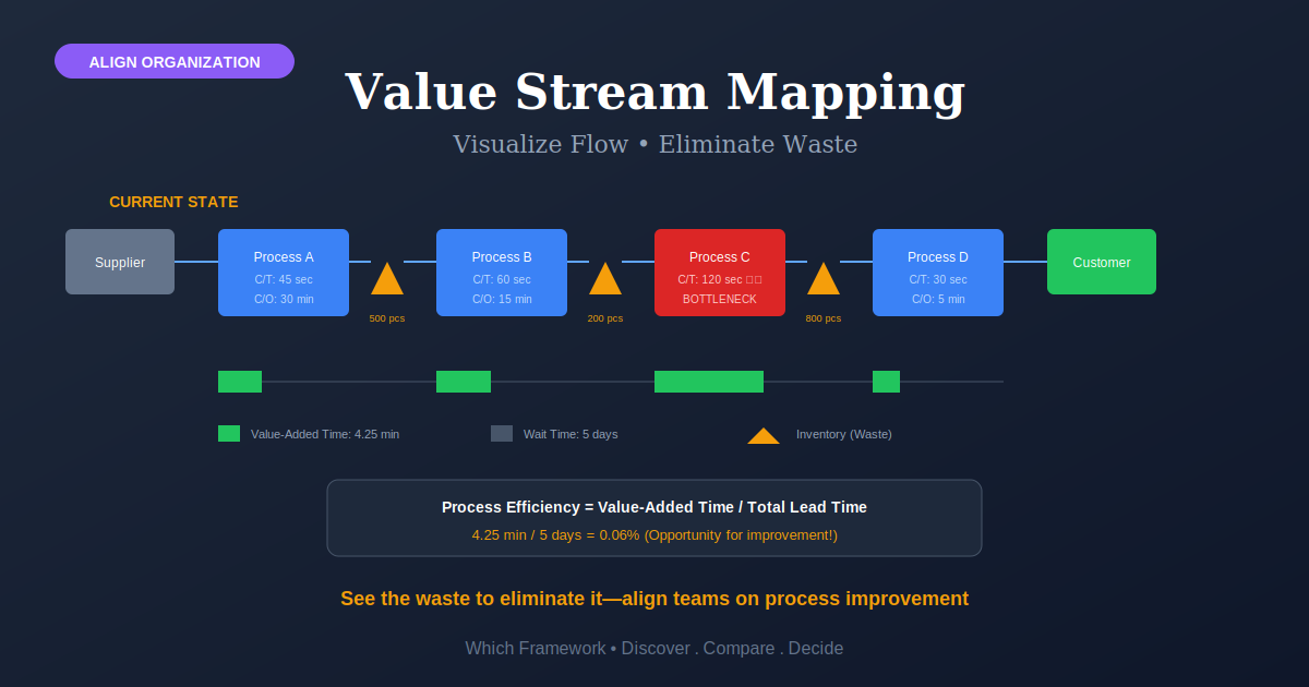
Value Stream Mapping: The Timeline That Shows Where the Days Go
Value Stream Mapping is a method for drawing an entire flow of work on one page, with a timeline along the bottom that separates the hours spent working from the days spent waiting.
Before you start
Is value stream mapping your framework?
Mapping answers one question: where does the elapsed time actually go? It is built for work that repeats, moves through several steps, and takes far longer than the work itself would suggest. If your problem is quality, or a single known bottleneck, other tools reach the answer faster.
| If your real problem is… | You probably want |
|---|---|
| We have system records of every step and want the map built from evidence | Process Mining — reconstructs the real flow from event logs, without a workshop or an argument Compare Mapping and Process Mining |
| We already know which single step limits everything | Theory of Constraints — skips the map and works the bottleneck directly Compare Mapping and Theory of Constraints |
| Defects and variation, rather than delay | Lean Six Sigma — statistical work on a defined defect |
| Work piles up and nobody can see the queue | Kanban — limits and visibility, no mapping required |
| The area is disorganized enough that timings are meaningless | 5S Methodology — stabilize conditions first, or you will map the chaos |
| Nobody owns the chain and it degrades every quarter | Business Process Management — ownership and governance rather than a one-off map |
| We want the idea that connects all of these | Lean Core Principles — mapping is the method behind principle two |
| Delivery takes weeks and we cannot say why | Value Stream Mapping — you are in the right place |
The test that separates a value stream map from a flowchart
Does it have a timeline along the bottom, and does that timeline have two numbers? One for time spent working, one for total elapsed time. If the map shows boxes and arrows but no such strip, it is a process diagram — useful, but it cannot show you the gap, and the gap is the entire reason to draw one.
What Is It?
Value stream mapping puts an entire flow of work on a single sheet: every step from customer request to delivery, the material moving between those steps, and the information that tells each step what to do. It is drawn by hand, by the people who do the work, walking the process rather than sitting in a room.
What separates it from any other diagram is the strip along the bottom. It records, for each step, how long the work takes and how long the item sits waiting. Add the two rows separately and you get a comparison that is uncomfortable in almost every organization that has never done it.
The usual result is that work accounts for a small fraction of elapsed time — often a few percent. That single ratio changes what people argue about. Teams stop debating how to make steps faster and start asking why items wait so long between them.
Quick Reference
The canonical structure
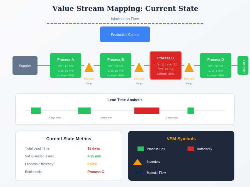
What is on a map
Four bands, read from the top down. The first three describe the process; the fourth is what makes it a value stream map.
| Band | What it shows | The test |
|---|---|---|
| Information flow across the top | What tells each step to start: the customer order, the forecast, the weekly schedule, the phone call someone makes when a job is urgent. Informal triggers belong here too, and they are usually the interesting ones. | Is the unofficial expediting call drawn on the map? |
| Process boxes along the middle | Each step, with its own numbers: how long one item takes, how long a changeover takes, how often the equipment or person is available, how many people work there. | Were these measured on the floor, or taken from a system? |
| Material flow between the boxes | What moves between steps and how much is sitting there. Inventory piles are drawn where they actually accumulate, with counts, because a pile is waiting time in physical form. | Does every arrow have a quantity against it? |
| The timeline along the bottom | A stepped line with two rows. The upper row records waiting between steps; the lower records the time spent working. Total them separately and you get lead time against process time — the number that changes the conversation. | What percentage of elapsed time is work? Under 10% is common. |
One map is not the exercise
Mapping produces three things in order, and stopping after the first is the most common way it fails. The current state map records what happens now. The future state map shows a version achievable within about a year. The implementation plan names who does what by when to get from one to the other.
A current state map on its own is a diagnosis nobody acted on. Teams find it satisfying because the ratio is shocking, and that feeling substitutes for a plan surprisingly often.
Reconciling sources
Value stream map or process map?
These get used interchangeably and they are not the same drawing. A value stream map is a specialized kind of process map — still following the flow, but adding quantities, information triggers, and the timeline.
| Shows | Best for | |
|---|---|---|
| Process map or flowchart | Steps, decisions and branches. No quantities, no timeline. | Explaining or documenting how something works |
| Value stream map | Steps plus material quantities, information triggers, and a lead-time timeline | Finding where elapsed time is lost |
| Process mining | The real flow, reconstructed from system event logs, including every variant | Processes that leave digital records, where opinions differ |
Which to reach for
If your process runs through systems that log every step, process mining will build a more accurate picture in less time and settle arguments a workshop cannot. Mapping wins where the delays live between the systems — in trays, in email, in a truck, in someone’s head — because those never reach a log. Most real value streams contain both, which is why the two are often run together.
Core Features
- Whole flow, one page: door to door, not one department’s section of it
- Drawn by hand, on the floor: walked backwards from the customer, not built from a system export
- Information as well as material: what triggers each step is half the diagram
- The timeline is mandatory: without it the drawing is a flowchart
- One product family at a time: mapping everything at once produces something unreadable
- Three deliverables: current state, future state, and a dated plan
Worked example
A pathology lab, and the courier nobody had drawn
An illustrative composite. A hospital pathology service in Ontario reported histology results in a median of nine days. Clinicians were escalating constantly. The lab had recently bought a second processor on the assumption that capacity was the constraint.
| Band | What it produced |
|---|---|
| Process boxes | Seven steps timed on the floor rather than taken from the lab system. Total hands-on work came to roughly six hours. |
| The timeline | Six hours of work inside nine days. Under 4% of elapsed time. The new processor was running at well under half its capacity, and had never been the constraint. |
| Material flow | The largest single wait was not in the lab at all. Specimens from two outlying clinics moved on a courier run that operated three times a week, so a sample taken on a Wednesday afternoon could sit until Monday. Nobody had drawn the courier because it was not lab work. |
| Information flow | Reports were released in a single batch each afternoon, adding up to a further day. The batch existed because a printer had once been shared, and the printer had gone years earlier. |
| Future state and plan | Daily courier runs, release on completion, one merged check. Nine days became four within a quarter, with no equipment purchased. |
Why the map found what the lab could not
Both real causes sat outside the boundary the lab had been looking within. The courier belonged to logistics and the batch release belonged to an old print arrangement, so neither appeared in any lab report or any capacity model. A map drawn door to door includes them by construction, which is the whole argument for mapping the flow rather than the department.
The uncomfortable part is the processor. It was bought on a confident diagnosis that six hours of measurement would have overturned. Mapping is cheapest before the capital decision, and it is almost always done afterwards.
When to Use
- Delivery takes far longer than the work involved, and nobody can say where the time goes
- Work crosses several departments and each one reports that it is performing well
- You are about to buy capacity and have not checked whether capacity is the constraint
- Inventory or work in progress sits between steps in visible piles
- You are starting lean and need principle two made concrete
- A process runs partly outside your systems, so logs cannot see all of it
When NOT to Use
- The work is one-off, so there is no repeating stream to map
- The whole process is inside logged systems — process mining will be faster and more accurate
- The constraint is already known and agreed
- The problem is defect rates rather than elapsed time
- Nobody will own the future state, in which case you are producing a diagnosis for a drawer
In practice
How mapping goes wrong
The failures cluster around two things: drawing the map too narrowly, and treating the map as the deliverable.
| Failure mode | What it looks like | What to do instead |
|---|---|---|
| Mapping your own department | A tidy map that stops at the boundary, missing the wait on either side of it | Map door to door. The delays are usually in the handoffs you excluded. |
| No future state | A current state map, a shocking ratio, and nothing else | Do not end the workshop without a future state and a dated plan with names on it. |
| Times from the system | Figures pulled from software that records when someone pressed a button | Walk the process and time it. Systems record transactions, not waiting. |
| Mapping everything | An enormous wall chart covering every product, readable by nobody | One product family per map, chosen by volume or by pain. |
| Drawn by consultants | A beautiful digital map produced by people who do not do the work | Hand-drawn by the team. Accuracy and ownership both come from walking it. |
| Never redrawn | A framed map from three years ago describing a process since changed twice | Remap when the process changes materially, or take it down. |
Sourced
Evidence, and how to cite it
Toyota does not call it value stream mapping, and the name was a publishing decision.
At Toyota the tool is a material and information flow diagram, sometimes abbreviated MIFA. It came out of the Operations Management Consulting Division, an internal group of senior production experts, and reached the United States through the Toyota Supplier Support Center. Mike Rother and John Shook wrote the method down for the first time in Learning to See, published by the Lean Enterprise Institute in 1998, and it was they who named it value stream mapping. The workbook was nearly called Material and Information Flow Analysis for Lead Time Improvement and Work Place Kaizen; Daniel Jones suggested the published title.
Rother, M. & Shook, J. (1998) Learning to See. Brookline, MA: Lean Enterprise Institute; Shook, J., quoted in Baudin, M., ‘Where do value stream maps come from?’
The tool most associated with Toyota is barely used inside Toyota.
It was built for a narrow purpose: helping suppliers improve, and setting up new lines. Art Smalley of the Lean Enterprise Institute has written that there are no value stream maps in most Toyota plants because it was developed primarily as an analytical aid. Toyota alumni describe seeing the diagrams used only by supply chain engineers working with suppliers, not on the plant floor, where A3 reports do that work instead. None of this makes mapping less useful. It does mean presenting it as how Toyota runs its factories is inaccurate.
Smalley, A., Lean Enterprise Institute, quoted in the Project Production Institute review of value stream mapping; Liker, J., quoted in Baudin, M., ‘More about VSMs’.
“Value stream” is a Western term, and a deliberately flattering one.
The phrase comes from Womack, Jones and Roos, who introduced it in The Machine That Changed the World (1990) and told readers in Lean Thinking (1996) to map their value streams — without setting out how. Rother and Shook supplied the method two years later. As one commentator has noted, the map mostly shows waste rather than value, and “value stream map” has more appeal than “waste stream map”. It is an inventory of delay, not of value.
Womack, J.P., Jones, D.T. & Roos, D. (1990) The Machine That Changed the World; Womack, J.P. & Jones, D.T. (1996) Lean Thinking.
How to cite it.
Harvard: Rother, M. and Shook, J. (1998) Learning to See. Brookline, MA: Lean Enterprise Institute.
APA: Rother, M., & Shook, J. (1998). Learning to see. Lean Enterprise Institute.
For the term “value stream”, cite Womack and Jones (1996), not Rother and Shook. For the Toyota original, refer to the material and information flow diagram.
Key Strengths
- Reveals the ratio: the gap between work and elapsed time reframes what the team argues about
- Crosses boundaries: a door-to-door map includes the handoffs no department reports on
- Cheap: paper, pencils and a few days of walking the process
- Builds shared understanding: the people who drew it do not need convincing afterwards
- Sees what logs cannot: trays, couriers, email and waiting never reach a system record
Key Weaknesses
- A snapshot: it captures one path on one day and ages quietly
- Poor with variety: assumes a fairly consistent flow, so high-variation work maps badly
- Hides variation: single average figures conceal the spread that often causes the delay
- Easy to stop at the diagnosis: the current state map feels like an achievement
- Manufacturing vocabulary: changeover and uptime need translating for service work
Sequencing
What to run before and after
Mapping is a diagnosis. It needs a stable process to measure and something waiting to act on what it finds.
Before
Stabilize the area, and know what value means
Timing a disorganized area produces numbers that will not repeat. A 5S pass fixes that. And knowing what the customer actually values decides which steps count as waste once the map exists.
During
Check the map against the records
Where steps run through systems, mining the event logs will confirm or contradict what the workshop drew, and will show how often the exception path runs. Disagreements between the two are usually the finding.
After
Deliver the future state, and keep the flow
The plan is the deliverable. Kaizen events carry the individual changes, and kanban holds the flow once the waits are removed, so the queues do not quietly rebuild.
Common questions
Value stream mapping: quick answers
What is value stream mapping?
A method for putting a whole flow of work on one page: every step from request to delivery, the material moving between steps, the information telling each step what to do, and a timeline along the bottom separating time spent working from time spent waiting. It is drawn by hand by the people who do the work, walking the process. The timeline is what makes it a value stream map rather than a flowchart.
Who invented value stream mapping?
The tool came from Toyota's Operations Management Consulting Division, which used it with suppliers, and where it is called a material and information flow diagram. Mike Rother and John Shook wrote the method down for the first time in Learning to See, published by the Lean Enterprise Institute in 1998, and they gave it the name value stream mapping. The term “value stream” itself comes from Womack, Jones and Roos, who used it in 1990 and told readers to map value streams in 1996 without explaining how.
What is the difference between a value stream map and a process map?
A value stream map is a specialized process map. Both follow the flow of work, but a value stream map adds three things a flowchart does not have: quantities of material sitting between steps, the information triggers that start each step, and a timeline recording work time against waiting time. That timeline is the reason to draw one. Without it you have a useful diagram of how something works, but no way to see where the elapsed time goes.
What is on a value stream map?
Four bands. Information flow across the top: orders, forecasts, schedules and the informal calls that trigger work. Process boxes along the middle, each with figures for cycle time, changeover, availability and staffing. Material flow between them, with inventory piles drawn and counted where they accumulate. And the timeline along the bottom, whose two rows total separately to give lead time against process time.
What are current state and future state maps?
The current state map records how the work runs today. The future state map shows a version reachable in roughly a year, with the biggest waits designed out. The third deliverable is an implementation plan naming who does what by when. Stopping after the current state map is the most common way mapping fails: the ratio it reveals is startling enough to feel like an achievement, and the feeling substitutes for a plan.
Does Toyota use value stream maps?
Less than its reputation suggests. The diagrams were developed by an internal consulting group for use with suppliers and when setting up new lines, not as an everyday plant tool. Art Smalley of the Lean Enterprise Institute has written that there are no value stream maps in most Toyota plants because it was built as an analytical aid, and Toyota alumni describe seeing it used only by supply chain engineers. That does not make it less useful, but presenting it as how Toyota runs its factories is not accurate.
Value stream mapping or process mining?
Process mining reconstructs the real flow from the records your systems already keep, so it is faster, more accurate and harder to argue with wherever the process is fully digital. Mapping wins where the delays sit between the systems — in trays, in email, in a courier van, in someone's head — because none of that reaches a log. Most real value streams contain both kinds of delay, so the two are often used together rather than chosen between.
How do I cite value stream mapping?
Harvard style: Rother, M. and Shook, J. (1998) Learning to See: Value Stream Mapping to Add Value and Eliminate Muda. Brookline, MA: Lean Enterprise Institute. APA style: Rother, M., & Shook, J. (1998). Learning to see. Lean Enterprise Institute. For the term “value stream” itself, cite Womack and Jones (1996) rather than Rother and Shook. For the Toyota original, refer to it as the material and information flow diagram.
Deep Resources
Frameworks related to Value Stream Mapping
- Business Model CanvasA one-page visual framework for designing and analyzing business models across nine key…
- Theory of ConstraintsIdentify and manage the bottleneck limiting your system performance using the Five Focusing…
- Lean StrategyApply lean principles to strategy execution with rapid iteration, validated learning, and…