Wardley Mapping: How to Build the Canvas, and What Makes It a Map
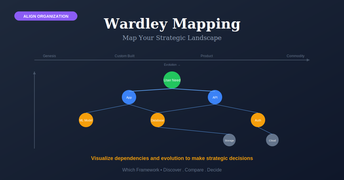
Wardley Mapping is a strategy technique that plots a value chain against four stages of evolution — genesis, custom-built, product and commodity — anchored on a user need.
Before you start
Is this your framework?
Wardley mapping answers one question: where are the pieces of our business on their way to becoming commodities, and what should we do differently about each. It is about situational awareness before strategy.
It is slow to learn and the first several maps will be wrong. If the decision is due this month, or the question is about customers rather than landscape, the table below points elsewhere.
| If your real problem is… | You probably want |
|---|---|
| We need to know whether this industry is structurally attractive | Porter's Five Forces — industry economics rather than component evolution Compare Wardley Mapping and Porter's Five Forces |
| We need to see where rivals sit on the attributes buyers weigh | Competitive Positioning Map — relative position on two chosen axes Compare Wardley Mapping and Positioning Maps |
| We want to escape competing on the same terms as everyone else | Blue Ocean Strategy — a structured challenge to industry assumptions |
| We need to understand what customers are trying to achieve | Jobs to Be Done — customer motivation, which a map takes as its anchor |
| We need to think about how external conditions might change | Scenario Planning — several plausible futures rather than one direction of travel |
| We need to turn a chosen direction into measures and objectives | OKR — execution, which the map informs but does not supply |
| We keep making build-versus-buy calls by instinct and getting them wrong | Wardley Mapping — you are in the right place |
What Is It?
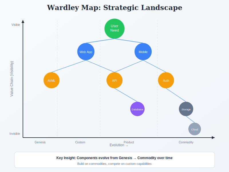
A Wardley map is a picture of everything your business needs in order to meet one customer need, arranged on two axes. The vertical axis puts the customer at the top and works downward through what their need depends on. The horizontal axis says how mature each of those things is.
Take a dispatcher who needs to know when a delivery van will arrive. That need sits at the top. To meet it you need vehicle locations. To get those you need telematics data from the vans. To process that you need compute. Each thing hangs below the thing it supports, and the further down you go the less the customer knows or cares that it exists. That column is the value chain.
The horizontal axis is where the technique earns its keep. Everything on the map is placed somewhere along four stages, and the stages describe how the wider market treats a component, not how new it is to you. Compute is the clearest illustration, because it has travelled the whole way in living memory:
- Genesis. Nobody has done it before. It is uncertain, expensive and built once by hand. Early computers were here: each machine a research project.
- Custom-built. Understood well enough to build deliberately, but still bespoke every time. Companies running their own server rooms, each one different.
- Product. Somebody packages it and sells it. You choose a vendor and buy or rent rather than build. Racked servers with a support contract.
- Commodity. Standardized, metered, and boring. You buy it by the unit without thinking about it, like electricity. Cloud compute is here now.
Two things follow from placing components this way, and they are the reason to do it. The first is that the right decision about a component depends on where it sits. Build something that already exists as a commodity and you waste money on a solved problem. Try to buy something at genesis and you usually cannot, and where you can, you give up the one place a lasting advantage is made.
The second is direction. Everything drifts rightward over time, whether you act or not. Compute did not stop at custom-built because anyone decided it should move on. What is a product today becomes a commodity, and the team still lovingly maintaining it is the last one to notice. A map makes that drift visible while there is still time to plan around it.
One last point, because it explains why this is called a map rather than a diagram. On an org chart or an architecture diagram you can move a box anywhere and nothing changes. Here, moving a component makes a claim that can be wrong — you have asserted something about how the market treats it. That is what makes a map arguable, and the argument is where most of the value turns out to be.
Quick Reference
The canvas
Building the canvas, in order
The order is not optional. Placing components before you have an anchor produces a systems diagram with an evolution axis drawn under it.
| Step | What you do | Where it goes wrong |
|---|---|---|
| 1. Anchor | Name the user and the need. Everything on the map exists to serve it. | Anchoring on your own organization rather than a user. "Our platform" is not a need. Without a real anchor the vertical axis has no meaning and the map cannot be wrong about anything. |
| 2. Value chain | List what the need depends on, then what those depend on, down to things you buy. Stack by visibility to the user. | Listing your systems instead of the chain of needs. The question at each level is what this requires, not what your architecture happens to contain. |
| 3. Evolution | Place each component horizontally using characteristics such as how ubiquitous and how certain it is. | Placing by how new it is to you. Evolution is about the market, not your familiarity. Something you built last month may sit firmly in commodity. |
| 4. Links | Draw the dependencies, then look at what the shape implies. | Stopping here. A map that nobody argues about has not been used; the disagreement about placement is the analysis. |
The two axes are not equally rigorous, and it saves time to know it
The evolution axis is the disciplined one. There are published characteristics for assessing where a component sits, and two people working carefully should converge. The vertical axis is a heuristic. Visibility to the user is a way of ordering the chain, not a measurement, and careful people place things at slightly different heights.
That asymmetry has a practical consequence. An argument about horizontal position is worth having. It is an argument about the market. An argument about vertical position is not, because the axis was never precise enough to settle it. Sessions that stall almost always stall on the vertical.
Using the map
Climate, doctrine and gameplay
A map is the landscape. Three separate things get done with it, and they are routinely muddled together. The distinction is about how much choice you have.
| What it is | Your choice in the matter | |
|---|---|---|
| Climate | Forces acting on every landscape: everything evolves toward commodity, success breeds inertia, shifts from product to utility arrive faster than expected. | None. Climate is read and anticipated, not chosen. It applies to your competitors identically. |
| Doctrine | Universal principles that hold whatever the landscape: know your users, use a common language, remove duplication and bias. | Adopt it. Doctrine is deliberately context-free, so it is not selected from the map. |
| Gameplay | Context-specific moves this map makes available, such as open-sourcing a component to push it toward commodity. | Everything. Gameplay is where the map earns its cost, and it is the part that cannot be copied from another organization. |
Most value arrives before any gameplay
The exciting part is gameplay, and it is not usually where the return is. Most organizations gain more from doctrine and from simply having a shared picture than from any clever move, because the common failure is not choosing the wrong gameplay but having no agreed view of the landscape to choose against.
The lineage explains the structure. Wardley took the five factors from Sun Tzu — purpose, landscape, climate, doctrine and leadership — and combined them with Boyd's OODA loop. The map is the landscape step. Jumping from purpose straight to decisions, skipping landscape and climate, is the failure the whole cycle is built to prevent, and it is what most strategy meetings actually do.
Core Features
- An anchor: a user and a need, which everything else serves
- A value chain: stacked by visibility to that user
- An evolution axis: genesis, custom-built, product, commodity
- Meaningful position: a component in the wrong place is wrong, not just untidy
- Direction of travel: everything drifts rightward whether you act or not
- Openly licensed: reproducible with attribution, unusually for a strategy method
Worked example
The most defended component was the one to stop building
An illustrative composite. A logistics software company in Tallinn, Estonia, with about 90 staff. It had an engineering budget to spend and three candidates for it. The argument had run for two quarters without settling.
| Stage | What it showed |
|---|---|
| The anchor took two sessions | The first attempt anchored on "our platform". That is not a user need, and with it the map would not have been wrong about anything. Re-anchored on a dispatcher needing to know where a vehicle is and when it will arrive. |
| The routing engine | Built in-house over four years and defended as core intellectual property. Placed against the evolution characteristics it sat firmly in product: several vendors, well-understood, bought rather than built by most of the market. The team had been treating a product as if it were genesis. |
| The disagreement that mattered | Two people placed the telematics integration three stages apart. The argument surfaced that one was thinking of the hardware, which is commodity, and the other of the data normalization across vendors, which is not. They were mapping two different components. |
| What sat at genesis | One thing: predicting arrival times from a mix of live traffic and driver behavior. Nobody had proposed investing in it, because it was not a product anyone was asking for. |
| What was decided | Routing moved to a bought engine over two quarters. The normalization layer, custom-built and genuinely differentiating, kept its team. The arrival-time work got two engineers as a deliberate bet. |
The most defended component was the one to stop building
Four years of investment and a firm internal belief that the routing engine was core. Placed on the evolution axis it was a product, and had been for some time. That assessment needed no insight into the company. It needed a look at the market. The build-versus-buy argument had never taken one, because it had been conducted entirely in terms of what the team could do.
The telematics disagreement is the more transferable lesson. Two people placing a component three stages apart looked like a judgment gap and was actually a definition gap: they were naming different things. Wide disagreement on the evolution axis is usually not disagreement at all. Splitting the component in two settled it in minutes. That is what a map does and a discussion does not: it makes the disagreement visible enough to name.
When to Use
- Build, buy or rent decisions keep being made by instinct
- You suspect effort is going into something the market has commoditized
- A leadership team disagrees about direction without knowing why
- Planning several years out, where components will move meaningfully
- Entering a landscape you do not know well
- There is appetite to argue about the map rather than approve it
When NOT to Use
- A decision is due before anyone could learn to map
- The question is about customers or pricing rather than landscape
- Nobody can name a user and a need, so there is no anchor
- The organization wants a template filled in rather than an argument
- The components are stable and evolution is not the live question
- A single small decision, where the effort exceeds the stakes
Using the map
How maps go wrong
Most failures are the map quietly becoming a diagram, which is hard to notice because it still looks like a map.
| Failure mode | What it looks like | What to do instead |
|---|---|---|
| No real anchor | Anchored on the company or the platform, so nothing on the map can be wrong | Anchor on a user and a need. If you cannot name one, that is the finding. |
| Evolution judged by familiarity | Something placed at genesis because it is new to your team, though the market has had it for years | Assess against the published characteristics: ubiquity, certainty, how it is bought. Evolution is about the market. |
| Arguing about the vertical | An hour spent on whether a component sits slightly higher, which the axis cannot settle | Accept approximate heights. Spend the argument on horizontal position, which is the rigorous axis. |
| Mapping the architecture | The value chain is a list of your systems rather than a chain of needs | At each level ask what this requires, not what you happen to have built. |
| The map as a deliverable | A beautiful map presented and approved, and no decision made differently because of it | End with a build, buy or rent call, or a named bet. The map is an input. |
| Drawn once | A map from eighteen months ago cited as current, with components that have since moved | Redraw when the landscape moves. The whole premise is that things do not stay put. |
| One person maps | A map produced alone and shown to the team, with the disagreements never surfaced | Map together. The argument about placement is the analysis, not a delay before it. |
Sourced
Evidence, and how to cite it
The technique dates to 2005, and the evolutionary framing to the year before.
Simon Wardley created the mapping technique at Fotango, a UK software company he ran as chief executive, in 2005, having developed the underlying evolutionary framing in 2004. He continued developing the method at Canonical between 2008 and 2010. The two dates are worth keeping separate: the claim that components evolve through identifiable stages came first, and the map is what he built to apply it.
Wardley, S. Wardley Maps: Topographical Intelligence in Business, published serially from 2016; corroborated by contemporaneous accounts of the Fotango period.
The claim to be a map, rather than a diagram, is specific and testable.
Wardley is precise about what distinguishes a map from a systems diagram, a customer journey or a blueprint: a map has an anchor, it has a direction of travel, and the position of a component carries meaning. The third is the operative one. On an org chart or an architecture diagram you can move a box anywhere and change nothing. On a Wardley map, moving a component asserts something about how evolved it is, and that assertion can be wrong. Any picture without those three properties is a diagram with an evolution axis drawn beneath it.
Wardley on the distinguishing properties of maps; see the chapters on finding a path.
The two axes are not equally rigorous, and Wardley says so.
The evolution axis is assessed against defined characteristics, including how ubiquitous a component is and how certain its behavior, and it is the axis the method treats strictly. The vertical axis is looser: visibility to the user is described as a heuristic for ordering the value chain rather than a measurement. This matters practically. Disagreement about horizontal position is disagreement about the market and is worth resolving; disagreement about vertical position is usually not resolvable and rarely changes a decision.
Wardley on the relative strictness of the two axes; the y-axis is explicitly described as visibility used as a heuristic.
There is no controlled evidence that mapping improves decisions.
The case rests on Wardley's own account, on the structure being borrowed from military strategy that has itself never been trialled in business, and on practitioner reports. No study compares organizations that map against comparable ones that do not, and the published examples are supplied by people who found it useful. The mechanism is plausible and the method is unusually honest about its own uncertainty. Treat it as a disciplined way to make assumptions about a landscape explicit and arguable, which it clearly is, rather than as a method with a demonstrated return.
Assessment of the strategy literature as of 2026; no controlled outcome studies of Wardley mapping are available.
How to cite it, and the license.
Harvard: Wardley, S. (2016–) Wardley Maps: Topographical Intelligence in Business. Published serially and openly.
APA: Wardley, S. (2016). Wardley maps: Topographical intelligence in business.
The work is licensed Creative Commons Attribution-ShareAlike, so maps and diagrams may be reproduced with attribution under the same license. That is unusual among strategy methods and worth knowing before reproducing anything.
Key Strengths
- Position means something: so the map can be wrong, and therefore argued about
- Answers build, buy or rent: from evolution rather than from instinct
- Surfaces definition gaps: wide disagreement usually means two different components
- Anticipates movement: the drift toward commodity is predictable
- Openly licensed: free to learn, use and reproduce with attribution
Key Weaknesses
- Steep to learn: the first several maps will be wrong
- One axis is a heuristic: and sessions stall arguing about it
- Degrades into a diagram: quietly, and it still looks like a map
- No controlled evidence: practitioner accounts and a plausible mechanism
- Needs redrawing: a map is current only while the landscape is
Sequencing
What to run before and after
A map describes the landscape. It takes the user need as given and hands the decision on to something else.
Before
Establish the user and the need that will anchor the map
Everything hangs off the anchor, and anchoring on your own organization produces a map that cannot be wrong about anything. If nobody can name a user need, that is the first problem.
During
Check the landscape against the wider competitive picture
A map shows how evolved components are, not whether the industry is worth being in or where rivals sit. Those are separate questions with their own tools, and a map that answers only its own is easy to over-read.
After
Turn the reading into commitments somebody owns
A map that ends in agreement rather than a decision has cost a week and changed nothing. Build, buy or rent calls and deliberate bets need owners, dates and measures.
Common questions
Wardley mapping: quick answers
What is Wardley mapping?
A way of drawing your business landscape so that position on the picture means something. Components are stacked by how visible they are to the user, and placed left to right by how evolved they are, from brand new to commodity. The result supports decisions about what to build, buy or rent, and about where the landscape is heading.
What are the four stages of evolution?
Genesis, where something is novel, uncertain and rare. Custom-built, where it is understood well enough to construct deliberately but is still bespoke. Product, including rental, where it is packaged and bought rather than built. And commodity, including utility, where it is standardized, ubiquitous and largely invisible. Everything drifts rightward over time.
How do you build a Wardley map?
Start with the user and the need you are meeting: that is the anchor. Work downward listing what that need depends on, and what those things depend on, until you reach things you buy. Then place each component along the evolution axis. Then draw the dependencies. The order matters, because placing components before you have an anchor produces a diagram rather than a map.
What makes it a map rather than a diagram?
Three properties Wardley is specific about: there is an anchor, there is a direction of travel, and the position of a component carries meaning. Move a box on an org chart or a systems diagram and nothing changes. Move a component on a Wardley map and you have made a claim about how evolved it is, which is either right or wrong.
What is Wardley's doctrine?
The universal principles he argues apply whatever landscape you are in: know your users, use a common language, remove duplication and bias, and so on. Doctrine is deliberately context-free, which is what distinguishes it from gameplay. It is meant to be adopted regardless of the map rather than chosen from it.
What is the difference between doctrine, climate and gameplay?
Climate is what happens whether you act or not, such as everything evolving toward commodity. Doctrine is what you should do regardless of context. Gameplay is what you might do given this particular map, such as open-sourcing a component to drive it toward commodity. Climate is read, doctrine is adopted, gameplay is chosen.
Are both axes equally rigorous?
No, and it is worth knowing. The evolution axis is the disciplined one, assessed against characteristics such as ubiquity and certainty. The vertical axis is looser, a heuristic for visibility to the user, and reasonable people place components at slightly different heights. Arguments about vertical position are usually not worth having; arguments about horizontal position usually are.
How do you cite Wardley mapping?
Cite Wardley, S. (2005 onward) Wardley Maps: Topographical Intelligence in Business, published serially and openly. The work is licensed Creative Commons Attribution-ShareAlike, so it can be reproduced with attribution. The technique was created at Fotango in 2005, following the evolutionary framing he developed the year before.
Deep Resources
Frameworks related to Wardley Mapping
- Porter's Five ForcesWhether the industry is worth being in, which a map does not answer…
- Competitive Positioning MapWhere rivals sit on the attributes buyers weigh, on two chosen axes…
- Scenario PlanningSeveral plausible futures, where a map assumes one direction of travel…