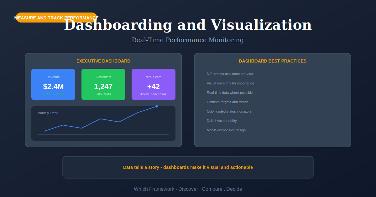
Dashboarding and Visualization: Which Dashboard Type, and Which Chart
Dashboarding is the practice of arranging selected measures into a visual display for monitoring, in three types by purpose: strategic, operational and analytical.
Before you start
Is this your framework?
This page covers two decisions: what kind of dashboard you are building, which governs refresh rate and density, and which chart to use for each number, which has more evidence behind it than most people realize.
It assumes the measures are already chosen. If the argument is still about what to track, a dashboard will render that argument in color and settle nothing.
| If your real problem is… | You probably want |
|---|---|
| We do not agree on which measures matter, so the dashboard keeps growing | Key Performance Indicators — selecting and owning measures, which has to happen first Compare Dashboarding and KPIs |
| We need measures spread across more than the financial picture | Balanced Scorecard — which areas get measured, before anything is displayed Compare Dashboarding and Balanced Scorecard |
| We cannot explain how our measures connect to each other | Strategy Map — the cause-and-effect chain a dashboard layout should reflect |
| We are reporting defect rates and quality figures specifically | Six Sigma Metrics — DPMO, sigma levels and yield, where the definitions matter more than the display |
| We want to compare our numbers against other organizations | Benchmarking — external comparison, where like-for-like is the hard part |
| The problem is that quarterly goals keep slipping, not that they are invisible | OKR — a goal-setting cycle rather than a monitoring surface |
| The measures are agreed and nobody can see or act on them | Dashboarding and Visualization — you are in the right place |
What Is It?
A dashboard puts the measures somebody needs to monitor into one place, arranged so they can be taken in without hunting. The stricter reading, and the one worth holding to, is that it fits on one screen and is read at a glance.
That distinction does real work. Anything that needs scrolling, filtering and interpretation is a report. Reports are useful and often more useful, but they are read in a different mode, and a surface designed as a dashboard while working as a report gets opened once a quarter by whoever has to present it.
The design problem splits into two questions that get answered separately. What kind of dashboard is this, which determines how often it refreshes and how dense it can be. And how should each number be drawn, which is the part with actual experimental evidence behind it.
The second question is worth taking seriously because the evidence is unusually clear and unusually ignored. People read some visual encodings far more accurately than others, and the ranking has been measured. Position beats length, length beats angle, and color sits near the bottom for reading a quantity. Most dashboard tools default to the encodings people read worst.
What no amount of chart selection fixes is the more common failure. Dashboards are usually abandoned for reasons that have nothing to do with how they look: they show what was easy to extract, nobody owns them, or they display numbers with no threshold, so a reader cannot tell whether what they are seeing is good.
Quick Reference
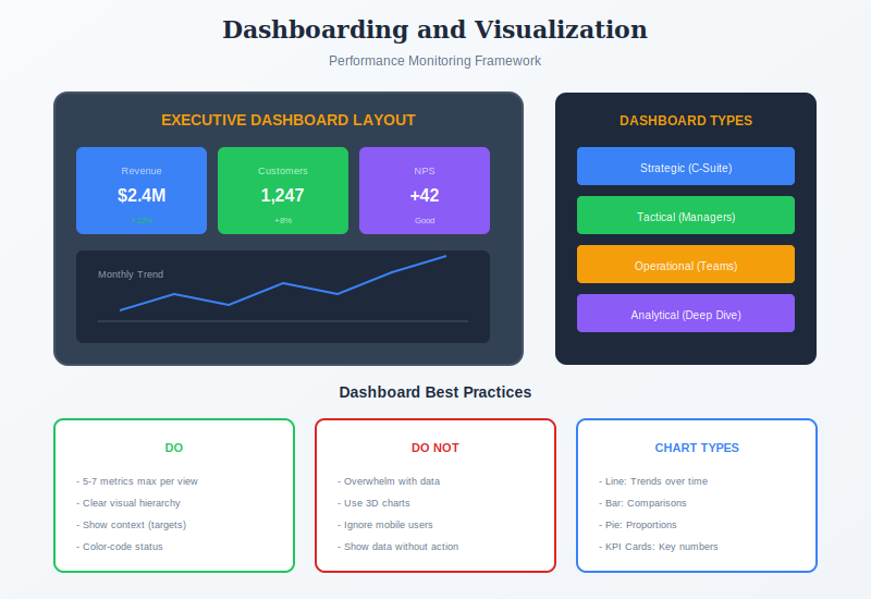
The types
Three dashboard types, three sets of rules
The three serve different people at different tempos, and the rules that make one good make another useless. Building all three as one screen is the usual reason a dashboard satisfies nobody.
| Type | Who reads it, and how often | What it needs, and what breaks it |
|---|---|---|
| Strategic | Executives and boards, monthly or quarterly. Read for direction, not for action today. | Needs targets, trend and comparison against plan. Broken by real-time data, which invites reaction to noise at a level that cannot act on it anyway. |
| Operational | The people running something, continuously. Read to notice that something needs attention now. | Needs thresholds and a way to make an exception obvious across a room. Broken by density. If it takes reading rather than glancing, it has failed at its only job. |
| Analytical | Analysts and managers, on demand. Read to work out why something happened. | Needs history, comparison and the ability to slice. Broken by oversimplification, and this is the one type where the single-screen rule genuinely does not apply. |
The refresh rate is the tell
If you cannot say how often a dashboard should update, the type has not been decided. Match the refresh rate to how often somebody can actually act, not to how often the data changes. A monthly-decision measure updated live produces a screen where the number is always moving and nothing ever means anything.
The most common request is a real-time strategic dashboard, and it is almost always the wrong thing. Executives asking for live data usually want confidence that somebody is watching, which is an operational dashboard owned by somebody else, plus a monthly view for them. Building one surface to do both gives a screen too dense to glance at and too shallow to investigate with.
Choosing
Which chart for which number
How accurately people read a quantity depends on how it was drawn, and this has been measured rather than argued. The practical rule is to match the encoding to how precisely the number needs to be read.
| Encoding | Typical chart | Use it when, and where it fails |
|---|---|---|
| Position on a common scale | Dot plot, scatter plot, line chart | Anything read precisely, and any comparison that matters. There is no case for choosing something lower down when precision is the point. |
| Length | Bar chart | Comparison across categories. Fails when the axis does not start at zero, which turns a length judgment into a lie. |
| Angle | Pie chart, donut | One part against a whole, when the split is lopsided and exact figures do not matter. Fails for ranking segments or for more than about four of them, which is most of how it gets used. |
| Area | Bubble chart, treemap | A third variable on a scatter plot, or rough proportions across many categories at once. Fails for precise comparison; readers underestimate large areas. |
| Volume | 3D bars and pies | Effectively never. The third dimension carries no data and makes the other two harder to read. This is the one row with no legitimate use in a dashboard. |
| Color hue and saturation | Heat map, choropleth | Categories, or a rough surface across geography or a grid. Fails as a way to read a quantity, and fails again if red and green carry the meaning. |
The ladder ranks precision, not quality
Lower on the list does not mean forbidden. It means the reader will be less accurate, which is fine when accuracy is not what you need. A heat map of order volume by hour and weekday is a good use of color, because the question is where the hot patch is, not what the number is. The error is using a low-accuracy encoding for a high-accuracy question, which is what a pie chart of seven similar-sized segments does.
Two practical consequences. Never encode meaning in red and green alone, since a substantial minority of readers cannot separate them; add a shape, a position or a label. And treat 3D as the one genuine prohibition on this page: it adds a dimension carrying no information and degrades the two that do.
Core Features
- A stated type: strategic, operational or analytical, decided before anything is drawn
- A refresh rate matched to decisions: not to how often the data changes
- Thresholds, not bare numbers: the reader can tell whether what they see is good
- Encodings matched to precision: position and length for anything read closely
- An owner: one named person who notices when it breaks or goes stale
- A removal habit: anything not looked at in a quarter comes off
Worked example
Thirty-one elements, two of them used
An illustrative composite. A grocery delivery business in Bogotá, Colombia, running about 40,000 orders a week. The operations dashboard had 31 elements on it and was projected on a screen in the control room. Nobody could say when it had last changed anything.
| What was found | What it meant |
|---|---|
| Three dashboards in one | Monthly revenue against plan sat beside live driver locations and a six-month cohort retention chart. Executive, operational and analytical content on one screen, refreshing every thirty seconds, so the monthly figures flickered and the live ones were buried. |
| No thresholds anywhere | Twenty-two of the 31 elements showed a number with no target, no band and no comparison. Staff in the control room could read every figure and could not tell which ones were a problem. |
| The encodings were upside down | Order status was a 3D pie with nine segments; late deliveries by zone were a color-graded map. The two numbers people acted on were drawn with the two encodings read least accurately. |
| What was actually used | Watching the room for a week: staff looked at two things, orders unassigned past ten minutes and drivers idle. Neither had a threshold and both were in the bottom corner. |
| The rebuild | Split into three. The control room screen kept six elements, all with thresholds, the two most-used as bar charts across the top. Strategic content moved to a monthly view. Analytical content moved to a tool analysts already opened. Cost was about COP 18 million in analyst time. |
Watching who looked at what was worth more than any design principle
Two of 31 elements were being used. That was not discoverable from the requirements, from the tool, or from asking — asked directly, the team named eight or nine things they said were essential. It came from standing in the room for a week. Every other finding followed from that one.
The chart changes helped and were the smallest part. Replacing the 3D pie with a bar chart made order status readable; giving the two used measures a threshold made them actionable. But the change that mattered was removing twenty-five things, and the reason it was possible to remove them was evidence that nobody was looking. Without that evidence, every element on a dashboard has a defender.
When to Use
- The measures are agreed and the problem is visibility rather than selection
- Somebody needs to notice an exception while there is still time to act
- A recurring meeting spends its first twenty minutes assembling the same numbers
- A handover, where the health of an area needs to be visible to a newcomer
- Data exists in several systems and nobody sees it together
- After a measurement exercise, to put the surviving measures somewhere
When NOT to Use
- Which measures matter is still contested; the dashboard will not settle it
- The data is unreliable, and displaying it prominently will only spread the error
- Nobody has authority to act on what the dashboard would show
- A one-off question, which is an analysis rather than a monitoring surface
- The real problem is that decisions are not being made, not that data is missing
- There is no owner, so it will drift out of date and quietly lose trust
In practice
How dashboards go wrong
Most of these are additions nobody refused rather than mistakes anybody made. Dashboards decay by accumulation.
| Failure mode | What it looks like | What to do instead |
|---|---|---|
| Numbers without thresholds | A screen of accurate figures where no reader can tell which are a problem | Every element gets a target, a band or a comparison. If none can be defined, it does not belong. |
| Three dashboards in one | Board metrics, live operations and cohort analysis sharing a screen and a refresh rate | Split by type. Each gets its own audience, density and refresh rate. |
| Accumulation | Thirty elements, each added by someone who asked, none ever removed | Review quarterly and remove what nobody opened. Measure usage rather than asking. |
| Showing what is easy to extract | Whatever the system exports, whether or not anyone decides on it | Start from the decision and work back. A missing measure is a finding, not a reason to substitute. |
| Decorative encoding | 3D bars, gradients, gauges and dials taking a quarter of the screen for one number | Use position and length for anything read closely. Reserve the space for more information. |
| Meaning carried by red and green alone | Status shown only by color, unreadable for a substantial minority of viewers | Add a second cue: position, shape, or a written label. |
| No owner | A feed breaks, the chart shows stale data for weeks, trust does not come back | Name one person. Alert on staleness, not only on the values themselves. |
Sourced
Evidence, and how to cite it
The encoding ranking is experimental, not aesthetic preference.
Cleveland and McGill identified elementary perceptual tasks people use to read quantities from graphs, then ran experiments measuring how accurately each was performed. Position judgments on a common scale were most accurate, followed by position on non-aligned scales, then length, direction and angle, then area, then volume and curvature, with shading and color saturation least accurate. Heer and Bostock replicated the experiments through crowdsourced participants in 2010 and reached similar findings.
Cleveland, W.S. and McGill, R. (1984) ‘Graphical perception: theory, experimentation, and application to the development of graphical methods’, Journal of the American Statistical Association, 79(387), pp. 531–554.
The familiar ladder is Mackinlay's refinement, not Cleveland and McGill's original.
The ranking reproduced everywhere — position, then length, then angle, then area, then volume, then color — separates length above angle. Cleveland and McGill grouped length, direction and angle together at a single level. The finer ordering by data type comes from Jock Mackinlay's 1986 work on automating graphical design, which built on their results. Worth getting right when citing, because the two are routinely conflated and the distinction is exactly where the pie-versus-bar argument lives.
Mackinlay, J. (1986) ‘Automating the design of graphical presentations of relational information’, ACM Transactions on Graphics, 5(2), pp. 110–141.
The single-screen definition is Stephen Few's, and it is a design constraint rather than a description.
Few defined a dashboard as a visual display of the information needed to achieve objectives, consolidated onto a single screen so it can be monitored at a glance. The constraint is the useful part: it rules out most of what gets called a dashboard, and it forces the question of what would be dropped. Tufte's earlier argument about the data-ink ratio points the same way, that decoration competing with data should be removed, though taken to its limit it strips out context readers rely on.
Few, S. (2006) Information Dashboard Design. Sebastopol: O'Reilly; Tufte, E.R. (1983) The Visual Display of Quantitative Information. Cheshire: Graphics Press.
There is no comparable evidence that dashboards improve decisions.
The perceptual research establishes how accurately people read a chart. It says nothing about whether having a dashboard leads to better decisions, and that question has not been answered with anything like the same rigor. Adoption studies exist but cannot separate the effect of the dashboard from the effect of the organization that built one. This matters practically: the evidence supports specific choices about how to draw a number, and does not support the assumption that displaying more numbers helps.
Assessment of the visualization and management literature as of 2026.
How to cite it.
Harvard: Cleveland, W.S. and McGill, R. (1984) ‘Graphical perception’, Journal of the American Statistical Association, 79(387), pp. 531–554.
APA: Cleveland, W. S., & McGill, R. (1984). Graphical perception. Journal of the American Statistical Association, 79(387), 531–554.
For the ranked ladder, cite Mackinlay (1986). For data-ink, cite Tufte (1983). For dashboard design, cite Few (2006).
Key Strengths
- Makes an exception noticeable: the one thing a screen does better than a report
- Removes assembly work: nobody rebuilds the same figures before each meeting
- Chart choice has real evidence behind it: unusual in management practice
- Forces thresholds: designing one exposes measures nobody can say a target for
- Survives handover: a newcomer can see the state of an area on day one
Key Weaknesses
- Accumulates: adding an element is easy and removing one is political
- Shows the available, not the important: extractability quietly sets the agenda
- Tool defaults are poor: gauges, 3D and pies are usually one click away
- Decays silently: a broken feed shows stale numbers rather than an error
- Substitutes for deciding: building one can feel like progress on the underlying problem
Sequencing
What to run before and after
A dashboard is the last step in a measurement chain. Built earlier, it displays whichever numbers happened to be available.
Before
Choose the measures, and give each one a target
A dashboard displays decisions already made about what matters. Without thresholds it shows figures nobody can evaluate, which is the most common reason one stops being opened.
During
Decide the type, then lay it out to match the causal chain
Strategic, operational and analytical need different densities and refresh rates. Layout should reflect how the measures relate, so a reader can trace an effect back rather than scanning at random.
After
Watch who uses it, and remove what they do not
Asking produces a longer list than observing. Usage data, or a week of watching, is the only reliable basis for taking things off, and taking things off is what keeps a dashboard usable.
Common questions
Dashboards: quick answers
What is a dashboard?
A visual display of the information needed to monitor something, arranged so it can be taken in without hunting. The stricter reading, which is worth holding to, is that it fits on one screen and is read at a glance. Anything that needs scrolling and interpretation is a report, and reports are useful, but they are read differently and should be designed differently.
What are the three types of dashboard?
Strategic dashboards track progress against goals for executives and refresh slowly, often monthly. Operational dashboards monitor something happening now and refresh continuously, so their job is to make an exception obvious. Analytical dashboards support investigation and need comparison, history and the ability to slice the data. The three want different refresh rates, different densities and different amounts of interactivity.
Which chart type should I use?
Match the encoding to how precisely the number has to be read. Position on a common scale is read most accurately, then length, then angle, then area, then volume, then color. So a dot plot or bar chart beats a pie chart for comparison. Lower-accuracy encodings are still right when precision is not the point, such as color for categories or a map for geography.
Are pie charts bad?
They are read less accurately than bars, because judging angle and area is harder than judging length. That makes them a poor choice for comparing similar values or for more than about four segments. They are defensible for showing one part against a whole when the split is lopsided and the exact figures do not matter. The usual mistake is using one where the reader needs to rank the segments.
How many things should be on a dashboard?
Few enough to fit one screen without shrinking anything past legibility, which in practice tends to mean five to nine elements. The limit is not arbitrary aesthetics: past that point people stop scanning and start searching, which is a different and slower activity, and the thing that makes a dashboard worth having is gone.
Why does nobody look at our dashboard?
Usually one of four reasons. It shows what is easy to extract rather than what anyone decides on. It has no owner, so nobody notices when it breaks. It refreshes on a cycle unrelated to when decisions are made. Or it shows numbers with no threshold, so a reader cannot tell whether what they are looking at is good. The last one is the most common and the easiest to fix.
What is the data-ink ratio?
Edward Tufte's idea that the proportion of a graphic's ink devoted to showing actual data should be high, and that decoration competing with the data should be removed. In dashboard terms: drop gridlines, gradients, drop shadows, 3D effects and heavy borders unless they earn their place. Taken to extremes it can strip out useful context, so treat it as a direction rather than a rule.
How do you cite dashboard design sources?
For the perceptual evidence, cite Cleveland, W.S. and McGill, R. (1984) in the Journal of the American Statistical Association 79(387). For the familiar ranked ladder, cite Mackinlay (1986), who refined it. For data-ink, cite Tufte, E.R. (1983) The Visual Display of Quantitative Information. For dashboard design specifically, cite Few, S. (2006) Information Dashboard Design.
Deep Resources
Frameworks related to Dashboarding
- Key Performance IndicatorsChoosing and owning the measures a dashboard displays, which has to happen first…
- Balanced ScorecardWhich areas get measured, so the dashboard is not just whatever was extractable…
- Strategy MapThe cause-and-effect chain a good dashboard layout should let a reader trace…