Customer Journey Mapping: Stages, Touchpoints and the Emotion Curve
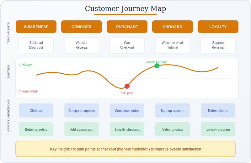
Customer Journey Mapping is a visualization method that sets out one persona’s path toward a goal in five layers — stages, touchpoints, actions, emotion and opportunities — to show where an experience works and where it breaks.
Before you start
Is this your framework?
A journey map answers one question: what is the whole experience like for one kind of customer, and where does it break? Its value comes from spanning departments. Marketing sees acquisition, support sees complaints, product sees usage, and nobody sees the sequence the customer actually lives through.
It follows that a map covering every customer covers none of them. One persona, one scenario is not a simplification but the condition that makes the map say anything specific. Two personas need two maps.
| If your real problem is… | You probably want |
|---|---|
| We need to understand one customer type before mapping anything | User Personas — the map needs a persona to be about, and it should exist first Compare Journey Mapping and Personas |
| We need one persona’s thoughts and feelings on a page, without a timeline | Empathy Mapping — a snapshot of a mindset rather than a sequence of events Compare Journey Mapping and Empathy Mapping |
| We need to know what customers are hiring the product to accomplish | Jobs to Be Done — the goal behind the journey, which tells you which journey to map |
| The problem is internal: handoffs, queues and rework inside our own process | Value Stream Mapping — the same idea turned inward, measuring time and waste |
| We need to redesign the process itself, not just see it | Business Process Management — governed change to how work runs |
| We need a measure of how satisfied customers are overall | Net Promoter Score — a number, where a map gives you the reasons behind it |
| Nobody in the organization can describe the customer’s experience end to end | Customer Journey Mapping — you are in the right place |
What Is It?
Organizations are arranged by function and customers are not. A person buying insurance, opening an account or booking a repair moves across marketing, sales, operations and support in one continuous experience, while each of those departments sees only its own portion. A journey map exists to put that sequence on a single page so it can be discussed as a whole.
The method is straightforward. Pick one persona and one scenario — a specific customer type pursuing a specific goal. Lay their path out in order. Record what they do, where they encounter the organization, and how the experience feels at each point. The result is a chart read left to right, with several stacked layers, described in the next section.
Two terms cause most of the confusion here. A customer journey framework usually means the stage model an organization has settled on — awareness, consideration, purchase, onboarding, loyalty, or whatever suits its business. That names the phases. The map is the artifact that plots one persona’s real experience through those phases, with evidence attached. The framework is the skeleton; the map is what happens when you hang findings on it.
The emotion curve deserves particular mention, because it is what people remember about journey maps and also the layer most often invented. Plotted from real interviews it is the most useful row on the chart. Assigned by a team in a workshop it is a record of what the team assumes, drawn in a way that looks like data.
Journey mapping sits alongside User Personas, which supply the persona, and Empathy Mapping, which goes deeper on one mindset without a timeline.
Quick Reference
The structure
The five layers
Most journey maps stack the same five rows. The middle column is the one that matters: each layer has a source, and a layer filled in from the wrong source is the commonest way a map ends up confidently wrong.
| Layer | What it holds | Where it should come from | How it fails |
|---|---|---|---|
| Stages | The phases of the journey, in order, named from the customer’s point of view. | The customer’s own account of what they were trying to do. | Named after internal handoffs, so the map records the org chart rather than the experience. |
| Touchpoints | Every place the customer meets the organization: web, app, email, phone, branch, letter, third party. | Systems, channel logs and customers, cross-checked. Each source misses different touchpoints. | Only the channels you own get recorded. Comparison sites and resellers vanish. |
| Actions | What the customer actually does at each stage, including the workarounds. | Observation and interviews. Analytics show what happened, not what was attempted. | The ideal path is recorded instead of the real one, so failed attempts disappear. |
| Emotion | How the experience feels through the journey, usually as a curve with a low point and a high point. | Interviews, verbatim quotes, complaint records. This is the layer to be strictest about. | Assigned in a workshop, which produces the team’s assumptions drawn as if they were findings. |
| Opportunities | What could change, tied to a specific stage rather than floating free. | The pain points above them, prioritized separately. | Listed without owners, which is how a map becomes a poster. |
Why the emotion row carries the weight
Actions and touchpoints can usually be reconstructed from systems. Emotion cannot, and it is the row that tells you where to start, because the low point is where customers abandon, complain and tell other people. A map with an honest emotion curve and rough touchpoints is more useful than a complete map with an invented one.
The practical test is whether you can attach a quote to each point on the curve. If a dip cannot be traced to something a real customer said, it is a hypothesis, and it should be marked as one rather than drawn in the same ink as the rest.
Terminology
Journey map, experience map, blueprint, empathy map
Four visualizations circulate under loosely interchangeable names, and they answer different questions. Nielsen Norman Group set out the distinctions, and describes the lineage neatly: if journey maps are the children of experience maps, service blueprints are the grandchildren.
| Method | Scope | Whose view | Use it when |
|---|---|---|---|
| Empathy map | One persona’s mindset: what they say, think, do and feel. No timeline at all. | The customer, at a moment | Early, to build a shared picture of who you are designing for. |
| Customer journey map | One persona pursuing one goal with a specific organization, over time. | The customer, across a sequence | You need to find where your own experience breaks and fix it. |
| Experience map | A general human activity, chronological, deliberately not tied to any one company. | People in general | Entering a market you do not serve yet, or looking beyond your own customers. |
| Service blueprint | The same journey plus what happens inside: frontstage, backstage, and support processes. | The organization | The experience is omnichannel, or the fix needs several departments to move together. |
Which one you actually need
The distinction that matters most in practice is between the journey map and the service blueprint. A journey map tells you a customer waited eleven days and was frustrated. It cannot tell you why, because the reason sits in a queue, a system or a handoff the customer never sees. If your pain points keep resolving to “something internal is slow”, the map has done its job and the blueprint is the next artifact.
The experience map matters in a narrower case: when the interesting people are not yet your customers. A journey map can only describe those who reached you, which means it is structurally blind to everyone who gave up or never started.
Core Features
- One persona, one scenario: the constraint that makes a map specific
- Chronological: read left to right, as the customer lived it
- Stacked layers: stages, touchpoints, actions, emotion, opportunities
- Cross-functional by design: spans departments that each see one part
- Emotion as evidence: quotes behind the curve, not assumptions
- Opportunities with owners: the output is work, not a wall chart
Worked example
A German insurer, and the wait nobody owned
An illustrative composite. A mid-size household insurer in North Rhine-Westphalia, Germany, with about 400,000 policyholders. Claims satisfaction had fallen for six quarters and no department could say why, because each one reported good numbers for its own portion of the process.
| Step | What it produced |
|---|---|
| Persona and scenario | One persona, one scenario: a policyholder making a first water-damage claim. Earlier attempts had tried to map all claim types at once and produced a chart too general to argue with. |
| Evidence | Nineteen interviews with recent claimants, 400 complaint records coded by stage, and channel logs. The emotion curve was drawn only where a quote supported it; two stages were marked as assumptions. |
| The low point | Not the claim form, which everyone expected. It sat in the eleven-day gap between the loss adjuster’s visit and the settlement letter, during which the customer heard nothing and did not know whether anything was happening. |
| Why nobody had seen it | Every department’s metrics looked healthy. Adjusters met their visit targets, settlements met their processing targets. The gap belonged to no one, so it appeared in no report. Only a chart spanning both showed it existed. |
| What changed | Two automated status messages during the gap, plus a named contact. Claims satisfaction recovered over three quarters. The gap itself did not shorten at all. |
What the map found, and what it could not
The finding was in the gap between departments, which is the characteristic result. A journey map earns its cost when an organization is arranged in a way that hides the customer’s sequence, and every functional metric can be green while the experience is poor. Notice also that the fix addressed the silence rather than the delay: the customers were not upset about eleven days, they were upset about eleven days of not knowing.
What the map could not do was explain the eleven days. The reason lived in a scheduling queue and a handoff between two systems that no customer ever sees, so it appeared nowhere on a chart drawn from the customer’s side. Answering that needed a service blueprint. The map located the problem precisely and then reached the edge of what its own viewpoint can show.
When to Use
- The experience crosses departments and nobody owns the whole of it
- Functional metrics look healthy while satisfaction falls
- You need to find where customers abandon, not how many
- Designing a new service and needing to see it end to end first
- Teams disagree about where the real problem sits
- You can reach real customers to interview
When NOT to Use
- The problem is one screen or one interaction, not a sequence
- Customers cannot be reached, so the map would be assumptions drawn neatly
- The cause is known to be internal, which needs a blueprint instead
- Nobody has authority to act across the departments the map will cross
- It would be built to confirm a redesign somebody has already chosen
In practice
How journey maps go wrong
Journey maps fail in a distinctive way: they produce a handsome artifact that everyone admires and nobody acts on.
| Failure mode | What it looks like | What to do instead |
|---|---|---|
| The invented emotion curve | A smooth line drawn in a workshop, presented alongside real data and indistinguishable from it | Attach a quote to each point, and mark the points you could not evidence. |
| Mapping everyone at once | One chart covering all customer types and all scenarios, too general to disagree with | One persona, one scenario. Build a second map rather than widening the first. |
| The wall poster | A beautifully printed map, admired at the launch, referenced by nobody a quarter later | End with owners and dates against each opportunity, or do not end. |
| Stages named internally | Phases called Underwriting and Fulfillment, which no customer would recognize | Name stages in the customer’s words, taken from what they actually said. |
| Only the channels you own | Comparison sites, brokers and word of mouth missing, so the journey starts on your homepage | Ask customers what they did before they arrived. Most journeys start elsewhere. |
| Mapped once, never revisited | A map of a service that has since been redesigned twice, still on the wall | Treat it as a living document with a review date, or archive it honestly. |
Sourced
Evidence, and how to cite it
The method comes from service design, and the blueprint came first.
There is no founding paper for journey mapping itself. Its direct ancestor is service blueprinting, set out by G. Lynn Shostack in Harvard Business Review in 1984, which introduced the idea of drawing a service as a process with a line separating what the customer sees from what they do not. Journey mapping took the customer-facing half of that idea and made it the whole artifact. Nielsen Norman Group’s practitioner articles are now the most cited modern reference.
Shostack, G.L. (1984) ‘Designing services that deliver’, Harvard Business Review, 62(1); Gibbons, S. (2018) Journey Mapping 101. Nielsen Norman Group.
Four mapping methods are routinely treated as one.
Nielsen Norman Group distinguishes empathy maps, customer journey maps, experience maps and service blueprints by scope and viewpoint. Journey maps cover a specific persona interacting with a specific organization; experience maps take a general human perspective not tied to any company; blueprints turn the same journey around to face the business. Using the wrong one is not a labeling error but a scoping error, because each answers a question the others cannot.
Gibbons, S. (2017) ‘UX Mapping Methods Compared: A Cheat Sheet’, Nielsen Norman Group.
The emotion curve is the least evidenced part of most maps.
The layer that gives journey maps their persuasive force is also the one most often produced without data. Nothing in the format distinguishes a curve drawn from thirty interviews from one drawn by five people in a room, and the second is quicker and cheaper to produce. This matters because the low point normally determines where investment goes, so an invented curve does not merely fail to inform a decision — it directs one.
Widely noted in service design practice; see the discussion of evidence sources in Gibbons (2018).
How to cite it.
There is no single founding text, so cite the practitioner source you actually used. Harvard: Gibbons, S. (2018) Journey Mapping 101. Nielsen Norman Group.
APA: Gibbons, S. (2018). Journey mapping 101. Nielsen Norman Group.
For the service design tradition behind it, cite Shostack, G.L. (1984) ‘Designing services that deliver’, Harvard Business Review, 62(1), pp. 133–139.
Key Strengths
- Crosses departments: shows the sequence no single team can see
- Finds the gaps: problems live between functions, where metrics do not look
- Builds agreement: one page a whole organization can argue with specifically
- Locates effort: the low point says where to start, not just that something is wrong
- Travels well: readable by executives, designers and frontline staff alike
Key Weaknesses
- Easy to fake: an invented map looks identical to a researched one
- Stops at the visible: cannot explain causes hidden inside the organization
- Blind to non-customers: only describes people who reached you
- One persona at a time: broad coverage needs several maps and several budgets
- Often ends as an artifact: admired, framed, and not acted upon
Sequencing
What to run before and after
A journey map needs a persona to be about and an owner to act on it. Both sit outside the map itself.
Before
Decide whose journey, and toward what
The persona and the scenario are the two choices that determine whether the map says anything. Understanding the goal behind the journey also tells you where it truly starts, which is usually earlier than the organization assumes.
During
Gather evidence the emotion layer can rest on
Interviews and complaint records are what separate a researched curve from a drawn one. Empathy mapping goes deeper on a single mindset where a stage needs more than a point on a line.
After
Look inside, then change the process
Once the map names a pain point, the cause usually sits somewhere the customer cannot see. Turn the view around to the organization, then make the change stick with governed process work.
Common questions
Customer journey mapping: quick answers
What is customer journey mapping?
A method for setting out, in order, everything one type of customer does to accomplish a goal with an organization, together with what they encounter, think and feel at each step. The output is a single visual, and its purpose is to show a whole experience that no individual team sees end to end.
What is a customer journey framework?
Usually one of two things. It can mean the stage model an organization uses to describe its journey, such as awareness, consideration, purchase, onboarding and loyalty. Or it can mean the mapping method itself. The stage model names the phases; the map is the artifact that plots one persona's actual experience through them, with the evidence attached.
What are the layers of a customer journey map?
Five, in most versions. Stages divide the journey into phases. Touchpoints record where the customer meets the organization. Actions record what they do. Emotion tracks how the experience feels, usually as a curve. Opportunities record what could change. Some maps add a channel row or a metrics row, but those five carry the work.
What is the difference between a journey map and an experience map?
Scope. A journey map covers one persona pursuing one goal with a specific organization, so it can name real touchpoints and real failures. An experience map takes a general human perspective on an activity and is deliberately not tied to any single company, which makes it useful for entering a market you do not yet serve.
What is a service blueprint, and how is it different?
A service blueprint takes the same journey and adds what happens inside the organization to support it: frontstage actions the customer sees, backstage actions they do not, and the support processes beneath both. Nielsen Norman Group describes blueprints as part two of a journey map. They are the tool for omnichannel experiences and for problems spanning several departments.
What is emotional journey mapping?
Not a separate method, but the emotion layer of a journey map treated as the main event. Plotting how the experience feels at each stage produces a curve whose low point is usually where to start work. The value depends entirely on where the emotion data comes from: recorded from interviews it is evidence, assigned in a workshop it is a guess.
How do you create a customer journey map?
Choose one persona and one scenario before anything else, since a map covering everyone covers nobody. Gather evidence from real customers rather than from a workshop. Lay out the stages, then fill in touchpoints, actions and emotions from that evidence. Mark the low points. Then assign each opportunity an owner, or the map becomes a poster.
How do I cite customer journey mapping?
There is no single founding paper; the method grew out of service design and user experience practice. The most commonly cited practitioner sources are Nielsen Norman Group. Harvard style: Gibbons, S. (2018) Journey Mapping 101. Nielsen Norman Group. APA style: Gibbons, S. (2018). Journey mapping 101. Nielsen Norman Group. For the service design tradition behind it, cite Shostack (1984) on service blueprinting.
Deep Resources
Frameworks related to Customer Journey Mapping
- User PersonasResearch-based archetypes of the people you serve, and the starting point for any map…
- Empathy MappingWhat one persona says, thinks, does and feels, captured without a timeline…
- Value Stream MappingThe same idea turned inward: steps, waiting and waste inside your own process…