User Story Mapping: Building the Map, and Slicing It Into Releases
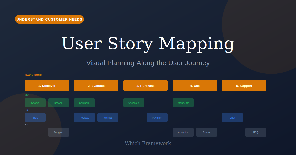
User Story Mapping is a planning technique that arranges user stories in two dimensions: a backbone of user activities across the top, and the stories supporting each activity hanging beneath it in order of necessity.
Before you start
Is this your framework?
Story mapping answers two questions at once: what are we building, and what does the first useful version of it contain. Both come from the same arrangement of cards.
It assumes you broadly know who the users are and what they are trying to do. If that is the open question, mapping will produce a confident picture of guesses. The table below says what to run first.
| If your real problem is… | You probably want |
|---|---|
| We do not actually know what customers currently experience or where it hurts | Customer Journey Mapping — research about the present, not a plan for the future Compare Story Mapping and Journey Mapping |
| We have the list and just need it ranked by likely return | RICE — scoring a backlog you already trust Compare User Story Mapping and RICE |
| We are unclear what problem users are hiring the product to solve | Jobs to Be Done — the underlying motivation, upstream of any feature list |
| We need to decide what is in and out of a fixed release | MoSCoW — categorical scope negotiation once the stories exist |
| The question is who our users are, not what they do | User Personas — a map needs to know whose journey it is describing |
| We need to plan one iteration, not a product | Agile Sprint Planning — the shorter horizon a map feeds into |
| Our backlog is a flat list and nobody can see what the product is any more | User Story Mapping — you are in the right place |
What Is It?
A backlog is a list, and a list has one dimension. Sort it however you like and it still cannot tell you what the product does, what order a user encounters things in, or whether the top twenty items add up to something anybody could use.
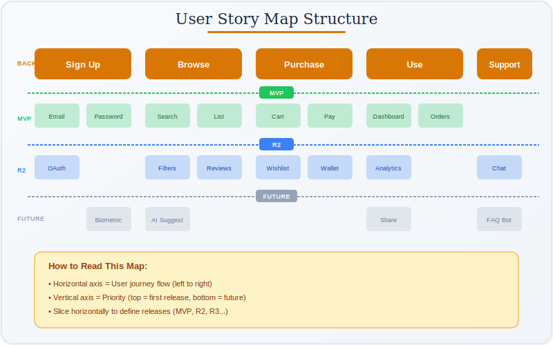
A story map adds the second dimension. Across the top runs the sequence of things a user does, in order: browse, choose, pay, track, receive. That row is the backbone. Beneath each activity hang the stories that support it, arranged with the most necessary at the top. The result is a picture of the whole product that can be read left to right as a narrative.
The payoff is in how you cut it. A flat backlog gets cut across the top; a map gets cut horizontally, all the way along. The first produces a set of features that may not work together. The second produces a version of the product that is thin but complete, where a user can get from one end to the other.
That thin complete slice is the walking skeleton, a term Patton borrowed from Alistair Cockburn. It is usually the single most useful output of the exercise, because it is the smallest thing you can put in front of a real person and learn from.
The other half of the value is not on the wall at all. The map is a byproduct of the conversation that builds it, and teams routinely discover during the session that they disagreed about what the product was. A map handed over finished, without that conversation, delivers a fraction of what the technique offers.
Quick Reference
Structure
The anatomy of a map
Three layers, and the discipline is keeping them at different altitudes. Most bad maps come from mixing them.
| Layer | What goes there | How it goes wrong |
|---|---|---|
| The backbone across the top | The activities a user moves through, in sequence, coarse enough to read aloud as a story. | Written as features rather than activities. If the top row says "search filters" instead of "find something to buy", the map has become a decomposed feature list with extra steps. |
| The tasks second row | The specific things a user does within each activity. Still user-facing, still phrased from their side. | Sliding into system behavior. "Validate card details" is what the software does; "pay for the order" is what the user does. |
| The details everything below | Variations, edge cases, alternatives. Ordered with the most necessary at the top of each column. | Left unordered, which is what makes slicing impossible later. Vertical order carries the priority information. |
The backbone is a test of whether you agree
Building the top row takes longer than teams expect, and that is the exercise working rather than stalling. Arguments about whether an activity comes before or after another, or whether two things are really one activity, are arguments about what the product is that would otherwise have surfaced during implementation.
A useful check: read the backbone out loud as a sentence, in order, without the cards below it. If it sounds like something a person does, it is right. If it sounds like a sitemap or a list of screens, the map has drifted into the solution and will not slice usefully, because screens do not have a natural order and journeys do.
Planning
Slicing it into releases
The map exists to be cut. A horizontal line across every column defines a release, and where you draw it is the real planning decision.
| Cutting a flat backlog | Cutting a map | |
|---|---|---|
| Shape of the cut | Take the top N items by rank. | Draw a line across the whole map at whatever depth you can afford. |
| What you get | The highest-value features, which may sit in three unrelated parts of the product. Possibly nothing a user can complete. | A thinner version of every activity, so a user can get all the way through. |
| What it can be used for | Demonstrations, often. Real use, sometimes not. | Real use, and therefore real feedback. |
| What it hides | Dependencies between highly ranked items and unranked ones. | Little. Gaps are visible as empty space in a column. |
The first slice should embarrass you slightly
The walking skeleton is meant to be thin to the point of feeling inadequate: one option where there will eventually be ten, a manual step where automation will go later. The test is not whether it is good, but whether somebody can get from one end of the backbone to the other. If they cannot, it is not a slice, it is a subset.
Teams resist this, reasonably, because a thin slice is not impressive. But an equal amount of effort spent completing one activity properly produces something nobody can use and nobody can give you feedback about. The thin version is worth more because it can be tried, and what it teaches usually changes what the later slices should contain.
Core Features
- Two dimensions: sequence across, necessity down
- A backbone of activities: user actions in order, not features
- Vertical ordering: most necessary at the top of each column
- Horizontal slices: releases cut across every activity, not down one
- A walking skeleton: the thinnest slice that still works end to end
- Built in conversation: the map is the residue, not the point
Worked example
180 ranked stories, and nothing a customer could finish
An illustrative composite. A logistics startup in Ho Chi Minh City, Vietnam, building a first product for small exporters. The backlog held 180 stories, ranked, and the team had been building the top of it for four months without anything a customer could use.
| Stage | What it showed |
|---|---|
| Building the backbone | It took most of a day, and two of the six activities were disputed. Half the team thought customs documentation came before booking a shipment; half thought after. Both had been building on their own assumption for four months. |
| Placing the 180 stories | Of the top 40 by rank, 31 sat under two of the six activities. Two activities had no completed stories at all, so nothing built so far let a customer get past step three. |
| The gaps became visible | Two columns were nearly empty, not because the work was unimportant but because nobody had written those stories. The backlog had been ranked thoroughly and was incomplete in a way a list cannot show. |
| The first slice | Fourteen stories across all six activities, including a manual step where the customs integration would later go, and one shipping partner instead of the planned twelve. |
| What happened next | The slice shipped in five weeks to three pilot customers. Two of the six activities turned out to matter far less than assumed; one that had been near the bottom of the backlog became the thing customers asked about most. |
The backlog was ranked carefully and pointed at nothing usable
Four months of work had produced 31 of the top 40 stories concentrated in two of six activities. Every individual prioritization decision had been defensible, and the aggregate was a product nobody could complete a task in. That failure mode is invisible in a list, because a list has no way to show that the work is clustered.
The other two findings came free. The disputed backbone ordering had been an unexamined disagreement running for four months. And two empty columns showed stories nobody had written — a gap that no amount of ranking would ever surface, since a ranking can only order what somebody thought to add. The map found both in a day.
When to Use
- The backlog has become a flat list nobody can see the product in
- Planning a first release, or the next substantial one
- Work has been delivered for months with nothing usable end to end
- A new team needs shared understanding of what is being built
- You suspect the backlog has gaps but cannot find them
- Scope needs cutting and everyone is arguing about individual features
When NOT to Use
- Who the users are, or what they need, is genuinely unknown
- The work has no user-facing sequence at all, such as infrastructure migration
- A single small feature, where a map is more ceremony than help
- The team cannot be in one place, physical or otherwise, to build it together
- An established product in steady maintenance with no release to plan
- Someone intends to build the map alone and present it
Planning
How story maps go wrong
The recurring pattern is that the map gets treated as a deliverable rather than as a way of having a conversation and cutting a release.
| Failure mode | What it looks like | What to do instead |
|---|---|---|
| A features list turned sideways | The backbone names screens or components, so there is no natural order and no useful slice | Read the top row aloud. If it is not something a person does, rewrite it as activities. |
| Built by one person | A tidy map presented to the team, and none of the disagreements surfaced | Build it together. The argument during construction is most of the value. |
| Never sliced | A beautiful map on a wall, and planning still done from the old flat list | Draw the release line in the same session. An unsliced map has done half a job. |
| A first slice that is not a slice | The release covers three of six activities thoroughly, so nobody can complete anything | Insist the line crosses every column. Thin everywhere beats complete somewhere. |
| Too much detail too early | Hundreds of cards, unreadable at a distance, and the shape is lost | Keep the top two rows coarse. Detail belongs below, and later. |
| Frozen after the session | The map is never updated, so it describes a plan that stopped being true weeks ago | Revisit it each release. It is a working artifact, not a record. |
| A tool that hides the whole | Digital cards that require scrolling, so nobody ever sees the map at once | Whatever the medium, preserve seeing it all and moving cards fast. Those are the two properties that matter. |
Sourced
Evidence, and how to cite it
The technique is Jeff Patton's, and it was described before it was named.
Patton set out the concepts in "It's All in How You Slice It" in Better Software in 2005, without calling the result a story map. The practice was named and illustrated at length in his 2008 writing on the user story backlog as a map, and the full treatment came in the 2014 O'Reilly book written with Peter Economy. The staged development is worth knowing when citing: 2005 for the idea, 2008 for the name, 2014 for the book most people mean.
Patton, J. (2005) ‘It’s All in How You Slice It’, Better Software; Patton, J. with Economy, P. (2014) User Story Mapping: Discover the Whole Story, Build the Right Product. Sebastopol: O'Reilly.
The walking skeleton is Alistair Cockburn's term, and Patton says so.
Patton is explicit that he borrowed it, and notes that others call the same idea a steel thread or a tracer bullet. It is a small point of attribution but a useful one, because the underlying idea predates story mapping and applies without it: build something that runs end to end, however thinly, before deepening any part. Story mapping supplies a way of seeing which stories make up that first thread.
Patton (2014), crediting Alistair Cockburn for the walking skeleton; the term also appears in Cockburn's writing on incremental delivery.
The failure it addresses is specific and well described.
The problem is not that flat backlogs are hard to read. It is that ranking a list and building from the top can produce a set of features that are individually valuable and collectively unusable, because a highly ranked item may depend on a low-ranked one that was deferred. Every prioritization decision looks defensible and the aggregate does not work. Two dimensions make the clustering visible, which one dimension cannot.
Patton (2014); the failure mode of incremental delivery is described in the Agile Alliance's account of story mapping.
There is no controlled evidence that mapping improves outcomes.
The case for story mapping rests on practitioner accounts and on the plausibility of the mechanism, not on studies comparing teams that map against teams that do not. Its reported benefits — shared understanding, gaps becoming visible, better first releases — are also difficult to separate from the effect of getting a team into a room to argue about the product for a day, which is not nothing but is not the map either. Treat it as a well-reasoned technique with a clear rationale rather than a measured intervention.
Assessment of the agile and product management literature as of 2026; no controlled outcome studies of story mapping are available.
How to cite it.
Harvard: Patton, J. (2014) User Story Mapping: Discover the Whole Story, Build the Right Product. Sebastopol: O'Reilly.
APA: Patton, J., & Economy, P. (2014). User story mapping: Discover the whole story, build the right product. O'Reilly Media.
For the origin, cite Patton (2005) in Better Software. For the walking skeleton, credit Cockburn, as Patton does.
Key Strengths
- Shows gaps a list cannot: an empty column is visible; a missing row is not
- Produces usable releases: horizontal slices work end to end
- Surfaces disagreement early: arguments about the backbone are arguments about the product
- Readable by anyone: stakeholders can follow a map without training
- Cheap: cards, a wall and a day
Key Weaknesses
- Needs the whole team present: most of the value is in the conversation
- Goes stale: a map nobody revisits describes a plan that has moved on
- Poor fit for non-sequential work: infrastructure has no user journey
- Degrades into a feature list: if the backbone drifts into screens
- Assumes you know the users: it will map guesses just as confidently
Sequencing
What to run before and after
A map lays out what to build. It takes for granted that somebody has worked out who for and why.
Before
Establish who the users are and what they are trying to achieve
A backbone is a claim about what users do in what order. If that is guesswork, the map will render the guess in a form that looks researched.
During
Order each column, then draw the release line
Vertical order is what makes slicing possible, and the slice is the output. A map built and not cut in the same session usually never gets cut.
After
Plan the iterations, and update the map as you learn
The slice feeds sprint planning. And a first release exists to teach you something, so expect the later slices to change once it has.
Common questions
Story mapping: quick answers
What is user story mapping?
A way of arranging user stories in two dimensions instead of one list. Across the top runs the sequence of activities a user goes through, called the backbone. Beneath each activity hang the stories that support it, ordered by necessity. The arrangement lets you see the whole product as a narrative and cut releases across it.
What is the backbone of a story map?
The row of activities along the top, in the order a user does them. Browse, choose, pay, track, receive. It is deliberately coarse: the backbone should read as a story someone could tell out loud, not as a feature list. Detail belongs in the cards hanging underneath.
What is a walking skeleton?
The thinnest slice across the whole map that still works end to end: the smallest set of stories that lets a user get all the way through. Jeff Patton borrowed the term from Alistair Cockburn, and notes others call it a steel thread or a tracer bullet. It matters because it is usable, where an equal amount of effort spent completing one activity would not be.
How does story mapping help prioritize?
It changes the shape of the cut. A flat backlog is ranked top to bottom, so building the top of it can deliver features that cannot be used together. A map is cut horizontally, so every release spans the whole journey and does something. You still decide what matters; the map stops you shipping half a product.
What is the difference between story mapping and customer journey mapping?
A journey map documents what a customer currently experiences, including feelings and pain points, and is used to find problems. A story map lays out what you are going to build and in what order. They look similar and answer different questions: one is research about the present, the other is planning for the future.
How many people should be in a story mapping session?
Small enough that everyone talks, which usually means five to eight. The team building it should be there, along with whoever understands the users. The value comes from the conversation while the map is built, so a map produced by one person and presented to the others has delivered very little of what the technique offers.
Do story maps need to be physical?
No, but the format matters more than the medium. What has to survive is the ability to see the whole map at once and rearrange it quickly while talking. Tools that force scrolling, or that make moving a card slow, remove most of the benefit. A wall works because both properties come free.
How do you cite user story mapping?
For the technique, cite Patton, J. (2014) User Story Mapping: Discover the Whole Story, Build the Right Product, O'Reilly, written with Peter Economy. For the origin, cite Patton's 2005 article in Better Software, which set out the concepts before the technique had that name. For the walking skeleton, credit Alistair Cockburn, as Patton does.
Deep Resources
Frameworks related to User Story Mapping
- Customer Journey MappingResearch about what customers experience now, where a story map plans what you will build…
- Jobs to Be DoneWhat users are trying to achieve, which the backbone of a map assumes you know…
- MoSCoW PrioritizationFixing what is in and out of a release once the stories are laid out…