Empathy Mapping: The Four Quadrants and How to Fill Them
Empathy Mapping is a synthesis method that sorts research about one type of user into labeled areas — what they say, think, do and feel — on a single page, so the team shares one picture of the person.
Before you start
Is this your framework?
An empathy map answers one question: what is it like to be this person right now? It has no timeline, covers no sequence, and describes no process. That narrowness is the point — it is the cheapest way to get a team holding the same picture of a user before anyone starts designing.
Its condition is research. The artifact takes an hour to build whether or not anyone has spoken to a user, and nothing in the finished page distinguishes the two. That is the single most important thing to know about the method.
| If your real problem is… | You probably want |
|---|---|
| We need to see what a person experiences across a whole journey, over time | Customer Journey Mapping — the same user, but as a sequence of stages with an emotion curve Compare Empathy Mapping and Journey Mapping |
| We need a durable, documented profile of a user segment | User Personas — a fuller artifact; an empathy map is often the step that sharpens one Compare Empathy Mapping and Personas |
| We need to know what the customer is trying to accomplish, not how they feel | Jobs to Be Done — the goal behind the behavior rather than the state of mind around it |
| We need to gather the research an empathy map would be built from | Voice of the Customer — the interviews and feedback that fill the quadrants |
| We need to work out what is worth solving in the first place | Design Thinking — empathy mapping is a tool inside its first stage, not an alternative to it |
| We need a number for how satisfied customers are | Net Promoter Score — measurement, where a map gives you texture |
| The team disagrees about who the user is and what they care about | Empathy Mapping — you are in the right place |
What Is It?
An empathy map is a single page with a user at the center and a few labeled areas around them, each holding what the team knows about that person. Research notes, interview quotes and observations get sorted into those areas until the page holds one coherent picture instead of a folder of transcripts nobody has read.
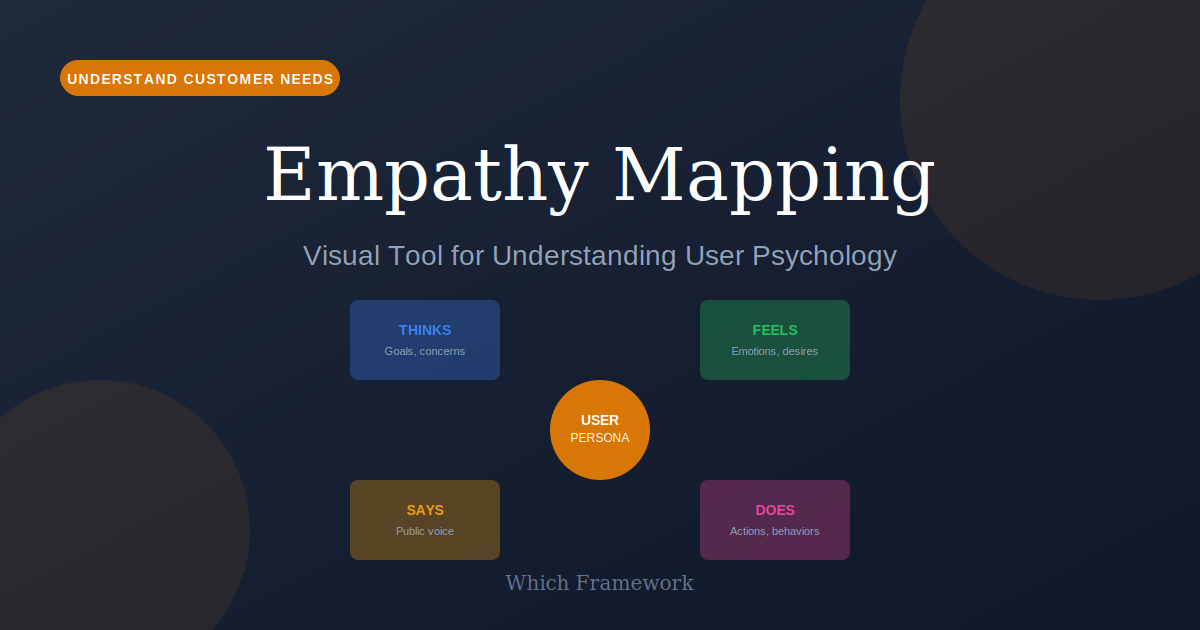
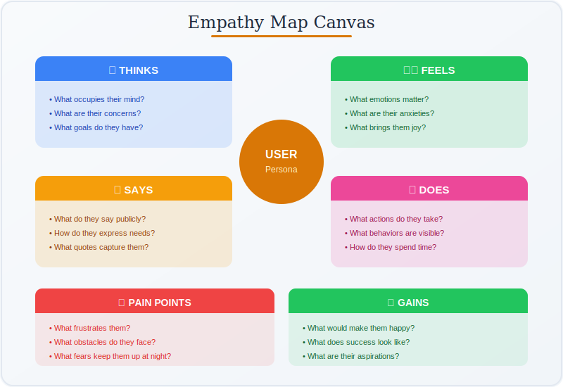
The most widely used arrangement has four quadrants: Says, Thinks, Does and Feels. Says holds direct quotes. Does holds observable actions. Thinks holds beliefs the person may hold but not voice. Feels holds emotional states and how strong they are.
Two of those quadrants are evidence and two are inference, which is the most useful distinction in the method and the one most often lost. You can watch what somebody does and record what they say. You cannot observe a thought or a feeling; you can only deduce it from behavior, tone and word choice. Dave Gray made this explicit in his 2017 revision by moving thoughts and feelings inside the drawn head, leaving the observable material outside it.
There is no single canonical layout. Three versions circulate under the same name and differ in ways that matter — particularly over whether pains and gains belong on the map at all. The three versions section sets out which is which.
Empathy mapping sits alongside User Personas, which it often sharpens, and Customer Journey Mapping, which takes the same user and adds time.
Quick Reference
The structure
The quadrants, and which are evidence
Four quadrants, two sources of truth. The third column is the one to read carefully: it says whether the content of a quadrant is something you recorded or something you concluded.
| Quadrant | What belongs in it | Where it comes from | Status |
|---|---|---|---|
| Says | Direct quotes, in the person’s own words. Not paraphrase, and not the team’s summary of the point. | Interview transcripts, support tickets, reviews | Observed |
| Does | Actions you watched, including the workarounds and the abandoned attempts. The most objective quadrant. | Contextual observation, session recordings, analytics | Observed |
| Thinks | Beliefs the person holds but may not say aloud, often because saying them is awkward or they seem obvious. | Deduced from what they said and did, and from what they avoided | Inferred |
| Feels | Emotional states and their intensity. Name the emotion specifically: anxious is a different design problem from confused. | Deduced from tone, word choice, body language, hesitation | Inferred |
Where the value actually is
It is not in the completed page. It is in the contradictions the page exposes — the gaps between what somebody says and what they do, or between a stated preference and an observed one. Those gaps are where the design opportunity usually sits, and they only become visible once quotes and actions are on the same sheet.
Which is why the observed and inferred halves need marking. If a team fills Thinks and Feels from the same confidence as Says and Does, no contradiction can ever appear, because the inferences were written to agree with the observations. The discipline is to write the inferred quadrants last, and to note which observation each one rests on.
Attribution
Three versions, and which one you have
Search for an empathy map template and the results look interchangeable. They are not. Three formats circulate, and the commonest confusion is asking one source for a section that belongs to another.
| Version | Sections | Published by | What it emphasizes |
|---|---|---|---|
| The XPLANE original 2010 | Think & Feel, See, Hear, Say & Do, arranged around a head, with Pain and Gain in a box beneath | Dave Gray, in Gamestorming; carried further by Osterwalder’s Business Model Generation the same year | The person’s whole environment, including what reaches them from other people |
| The Empathy Map Canvas 2017 | A numbered sequence: Goal first, then clockwise through See, Say, Do, Hear, with Think & Feel and Pains & Gains moved inside the head | Dave Gray, revising his own format after working with Alexander Osterwalder | The split between what can be observed and what can only be guessed |
| The four quadrants 2018 | Says, Thinks, Does, Feels. No See or Hear, and no Pains or Gains. | Nielsen Norman Group | Speed and simplicity as a synthesis step before personas or journey maps |
The mix-up worth knowing about
The Nielsen Norman version does not contain pains and gains. It has four quadrants and stops there. Pains and gains are Dave Gray’s, present in the 2010 original as a box at the bottom and moved inside the head in 2017. A template offering Says, Thinks, Does, Feels plus Pains and Gains is a blend of two sources, which is fine to use and misleading to cite.
If you are choosing rather than citing, the practical difference is scope. The four-quadrant version is faster and covers only the person; Gray’s versions add what they see and hear, which brings in the environment and the influence of other people. For a product used alone, the four quadrants are enough. For a decision shaped by colleagues, family or public opinion, the missing See and Hear sections are usually where the explanation lives.
Core Features
- One person, one page: a single user type, not a segment average
- No timeline: a state of mind, not a sequence of events
- Observed and inferred: half recorded, half deduced, marked apart
- Built collectively: the conversation is most of the value
- Contradiction-finding: gaps between saying and doing are the output
- Fast and disposable: under two hours, and cheap to redo
Worked example
A transport authority, and the wrong emotion
An illustrative composite. A regional public transport authority in Västra Götaland, Sweden, redesigning how occasional riders buy tickets. App purchases were high among commuters and low among everyone else, and a budget of around SEK 4 million was waiting on a decision about what to build.
| Step | What it produced |
|---|---|
| The first map | Built in ninety minutes from the team’s own knowledge. Feels was filled in with confused by the fare structure, which everyone agreed with immediately. The proposed fix was a fare calculator. |
| The research | Fourteen interviews and eight observed ticket purchases at stops and stations, run because one team member asked which quote the word confused had come from. There was none. |
| The correction | The dominant emotion was not confusion but anxiety about being fined. Riders understood the fares. What they did not trust was whether their ticket had actually activated before the inspector arrived, and several described checking the screen repeatedly. |
| The contradiction | Says and Does disagreed. Riders said the app was fine; observation showed them buying paper tickets at machines while holding an unlocked phone with the app installed. |
| What was built | Not a fare calculator. A large, unambiguous active-ticket state with a visible countdown, plus offline proof of purchase. App use among occasional riders rose over the following two quarters. |
Confused and anxious are different design problems
Both are plausible entries in a Feels quadrant, and they lead to entirely different products. Confusion suggests explanation: a calculator, better labels, a fares page. Anxiety about enforcement suggests reassurance: proof, state, evidence you can show an inspector. A map built from assumption produced the first reading, and it would have spent the budget on the wrong thing while everyone agreed the research had been done.
The check that caught it cost nothing: asking which quote a word in an inferred quadrant came from. It is worth applying to every entry in Thinks and Feels. Where there is no answer, the entry is a hypothesis, and marking it as one is the difference between a map that guides research and a map that replaces it.
When to Use
- At the start of a project, to align a team on who they are designing for
- After interviews, to synthesize transcripts into something usable
- When the team disagrees about what users actually care about
- To sharpen a persona that has become a list of demographics
- Before journey mapping, to settle whose journey is being mapped
- When you need shared understanding quickly and cheaply
When NOT to Use
- No research exists and none is planned, so the map records opinion
- The question is about a sequence of events rather than a state of mind
- You need a quantified answer rather than a qualitative picture
- The output would be used to justify a design already chosen
- The user group is genuinely several groups that need separate maps
In practice
How empathy maps go wrong
The method is cheap and quick, which is its virtue and the source of every failure below.
| Failure mode | What it looks like | What to do instead |
|---|---|---|
| Built from assumption | A complete, confident map produced in an hour with no research behind any quadrant | Ask which quote each entry came from. Mark the ones with no answer as hypotheses. |
| Vague emotions | Feels reading frustrated or confused — words that fit any user and point at no design | Name the specific emotion and its trigger. Anxious about X is actionable; frustrated is not. |
| Mapping everyone at once | One map covering all users, so every quadrant contains contradictory entries that cancel out | One map per user type. Two groups need two maps, not one wider one. |
| Paraphrasing the Says quadrant | Tidied summaries in place of quotes, losing the wording that carried the meaning | Use verbatim quotes. The exact phrasing is often the finding. |
| Smoothing the contradictions | Says and Does disagree, and the team edits one to match rather than investigating | Contradictions are the output. Chase them; do not tidy them away. |
| The map as the deliverable | A photographed wall, filed after the workshop, referenced by nobody afterwards | End with what the map changed: a research question, a design decision, or a discarded assumption. |
Sourced
Evidence, and how to cite it
The empathy map is Dave Gray’s, and it reached scale through two 2010 books.
Gray, founder of the consultancy XPLANE, developed the format as a workshop tool. It was published in Gamestorming in 2010, written with Sunni Brown and James Macanufo, and appeared the same year in Alexander Osterwalder’s Business Model Generation, which recommended building one per customer segment before completing a value proposition. Between them those two books put the format into design thinking, agile and lean startup practice, which is why it now appears in curricula that credit neither.
Gray, D., Brown, S. & Macanufo, J. (2010) Gamestorming. Sebastopol, CA: O’Reilly Media; Osterwalder, A. & Pigneur, Y. (2010) Business Model Generation. Hoboken, NJ: Wiley.
Pains and gains belong to Gray, not to Nielsen Norman Group.
The Nielsen Norman format has four quadrants: Says, Thinks, Does, Feels. It contains no pains or gains section, and no See or Hear. Those come from Gray’s original six-segment map, where Pain and Gain sat in a box beneath the head, and they remain in his 2017 canvas, relocated inside it. Templates that combine the four quadrants with pains and gains are blending two sources. That is a reasonable thing to do in practice and an inaccurate thing to attribute.
Gibbons, S. (2018) ‘Empathy Mapping: The First Step in Design Thinking’, Nielsen Norman Group; Gray, D. (2017) ‘Updated Empathy Map Canvas’.
Half the map cannot be observed, and the format does not say so.
Gray addressed this directly in his 2017 revision, moving Think and Feel inside the drawn head specifically to mark the difference between phenomena that can be watched and thoughts that can be guessed or inferred but never observed. Most templates in circulation, including the four-quadrant version, give all sections identical visual weight. Nothing then distinguishes a quotation from a supposition, and a reader arriving after the workshop has no way to tell which is which.
Gray, D. (2017) ‘Updated Empathy Map Canvas’, published on Medium.
How to cite it.
Harvard: Gray, D., Brown, S. and Macanufo, J. (2010) Gamestorming: A Playbook for Innovators, Rulebreakers, and Changemakers. Sebastopol, CA: O’Reilly Media.
APA: Gray, D., Brown, S., & Macanufo, J. (2010). Gamestorming. O’Reilly Media.
For the 2017 revision, cite Gray, D. (2017) ‘Updated Empathy Map Canvas’. For the four-quadrant version, cite Gibbons, S. (2018), Nielsen Norman Group.
Key Strengths
- Fast and cheap: under two hours, no specialist facilitation needed
- Builds shared understanding: the discussion is most of the value
- Surfaces contradictions: what people say against what they do
- Turns transcripts into something usable: a synthesis step that actually gets done
- Travels well: one page that engineers and executives both read
Key Weaknesses
- Indistinguishable when invented: a guessed map looks like a researched one
- Half of it is inference: and most templates do not mark which half
- No timeline: says nothing about sequence, process or where things break
- One user at a time: broad coverage needs several maps
- No agreed format: three versions circulate, which complicates citation
Sequencing
What to run before and after
An empathy map is a synthesis step. It needs raw material going in, and it earns its place by making the next artifact better.
Before
Get the research the quadrants will be filled from
Interviews and observation are what separate a map from a group opinion. Even a handful of conversations changes the output, because the Says quadrant then contains sentences nobody in the room would have written.
During
Work out what the person is actually trying to do
A map records a state of mind but not a purpose. Pairing it with the goal behind the behavior turns a description of a person into something you can design against.
After
Add time, then decide what to build
Once the persona is sharp, lay their experience out as a sequence to find where it breaks. Then the contradictions the map exposed become candidates for what to change.
Common questions
Empathy mapping: quick answers
What is an empathy map?
A single page that organizes what a team knows about one type of user into a few labeled areas, with the user at the center. It has no timeline and covers no sequence of events. Its purpose is to turn scattered research into a shared picture the whole team can point at and argue with.
What are the four quadrants of an empathy map?
Says, Thinks, Does and Feels, in the version published by Nielsen Norman Group. Says holds direct quotes. Does holds observable actions. Thinks holds beliefs the person may hold but not voice. Feels holds emotional states and their intensity. Says and Does can be observed; Thinks and Feels can only be inferred.
Does the Nielsen Norman Group empathy map include pains and gains?
No, and this is a common mix-up. The Nielsen Norman version has four quadrants only: Says, Thinks, Does, Feels. Pains and Gains come from Dave Gray's original XPLANE map, which had six segments, and they remain in his 2017 canvas. Searching for a Nielsen Norman map with pains and gains combines two different formats.
Who created the empathy map?
Dave Gray, founder of the consultancy XPLANE. The format reached a wide audience through Gamestorming, the 2010 facilitation book he wrote with Sunni Brown and James Macanufo, and through Alexander Osterwalder's Business Model Generation the same year, which recommended building one per customer segment. Gray published a revised canvas in 2017.
What changed in the 2017 empathy map canvas?
Gray reorganized it around a sequence rather than a set of boxes. It starts with a goal naming who you are empathizing with and what they need to do, then works clockwise through the observable areas: sees, says, does, hears. Think and Feel moved inside the head, and Pains and Gains moved in with them, to mark the difference between what can be observed and what can only be guessed.
What is the difference between an empathy map and a customer journey map?
Time. An empathy map captures one person's state of mind with no sequence at all. A journey map lays out what that person does over the course of a whole experience, stage by stage. The empathy map is usually the earlier and cheaper of the two, and is often used to sharpen the persona a journey map will follow.
How long does an empathy map take?
The workshop itself takes between thirty and ninety minutes. The research behind it takes considerably longer, and that is the part that determines whether the output is worth anything. A map built in an hour from good interview notes is useful; a map built in an hour from opinion is a record of what the team already believed.
How do I cite an empathy map?
Harvard style: Gray, D., Brown, S. and Macanufo, J. (2010) Gamestorming: A Playbook for Innovators, Rulebreakers, and Changemakers. Sebastopol, CA: O'Reilly Media. APA style: Gray, D., Brown, S., & Macanufo, J. (2010). Gamestorming. O'Reilly Media. For the 2017 revision cite Gray's Updated Empathy Map Canvas. For the four-quadrant version cite Gibbons, S. (2018), Nielsen Norman Group.
Deep Resources
Frameworks related to Empathy Mapping
- User PersonasResearch-based archetypes; an empathy map is often the step that sharpens one…
- Customer Journey MappingThe same user across a whole experience, stage by stage, with an emotion curve…
- Jobs to Be DoneWhat the person is trying to accomplish, rather than how they feel about it…