Kano Model: The Questionnaire, the Five Categories, and How to Score It
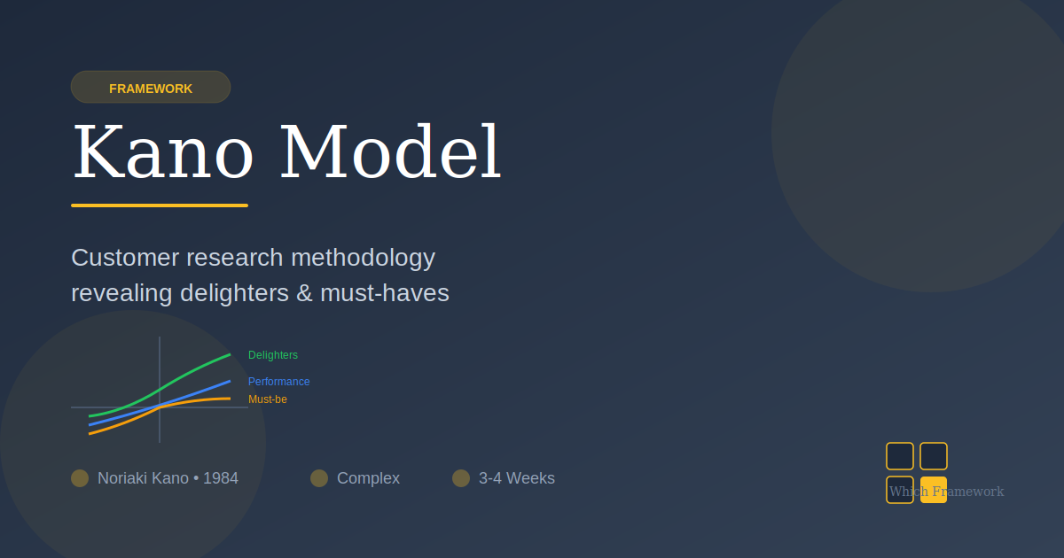
Kano Model is a classification of product features by how presence and absence affect satisfaction, in five categories: must-be, one-dimensional, attractive, indifferent and reverse.
Before you start
Is this your framework?
Kano answers one question: for this feature, does doing it better actually make anyone happier. For some features the answer is no, however well you do them, and that is worth knowing before you fund the work.
It needs a survey and several weeks. If the decision is due this month, or you only need a rough order, the table below points at faster things.
| If your real problem is… | You probably want |
|---|---|
| We need a rough order for thirty ideas by Friday | ICE Scoring — three estimates and a sort, with no research Compare Kano and ICE Scoring |
| We need a ranking we can defend, weighted by how many people are affected | RICE — adds Reach and Effort, still estimated rather than researched Compare Kano and RICE |
| We do not know what customers are trying to achieve in the first place | Jobs to Be Done — the underlying motivation, upstream of any feature list |
| We need to gather and structure customer input generally, not classify features | Voice of the Customer — how to collect needs and how many interviews it takes |
| We want one number to track loyalty over time | Net Promoter Score — a tracking metric, which tells you nothing about which feature to build |
| We need to see where the current experience hurts | Customer Journey Mapping — the present experience rather than future features |
| A backlog nobody can rank | The feature prioritization playbook, where the Kano Model is stage 2 of 5 |
| We are about to spend heavily on a feature and cannot tell whether anyone will notice | Kano Model — you are in the right place |
What Is It?
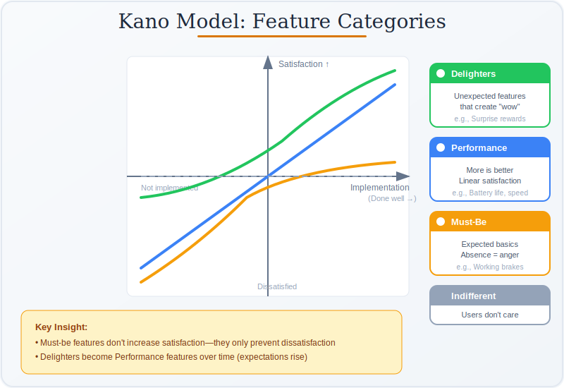
Some features only get noticed when they are missing. Hot water in a hotel is not a selling point; its absence is a complaint. Other features scale: the faster the checkout, the happier the customer, more or less proportionally. A third kind delights when present and is not missed when absent, because nobody expected it.
Kano's argument is that these three behave so differently that funding them the same way is a mistake. Perfecting a must-be gets you to neutral and no further. A team that pours a quarter into making an expected feature excellent has bought itself the absence of a complaint, which is worth something and is not what the business case promised.
Two more categories complete the set and get dropped from most summaries. Indifferent covers features customers do not care about either way, and finding them is often the most valuable output, because it is permission to stop. Reverse covers features that actively reduce satisfaction for a segment — extra configurability for people who wanted fewer choices.
The part that makes Kano a method rather than a diagram is the survey. Every feature is classified from a pair of questions, not from a workshop opinion. Most published treatments show the curves and never explain how anything gets placed on them, which leaves teams guessing at categories and calling it Kano analysis.
It is slow, and that is the honest cost. A study takes weeks, needs enough respondents per segment, and expires as expectations shift. What it buys is the one thing estimation cannot: evidence about which features are worth doing well and which merely have to exist.
Quick Reference
The method
The questionnaire, and the table that scores it
Each feature gets two questions with the same five answers. The pair is then read through a table that returns the category. The dysfunctional question is what makes it work: it separates a feature nobody wants from one everybody assumes.
| Asked | Wording | What it separates |
|---|---|---|
| Functional | How would you feel if the product had this? | Wanted from not wanted. On its own it produces a wish list, because almost everything gets a positive answer. |
| Dysfunctional | How would you feel if the product did not have this? | Assumed from optional. A must-be draws strong dislike here and indifference to the functional question. A single question cannot tell that apart from a feature nobody cares about. |
| Functional answer | Dysfunctional answer | Category returned |
|---|---|---|
| I like it | I dislike it | One-dimensional. Wanted when present, missed when absent. Satisfaction scales with quality. |
| I like it | I can live with it, or I am neutral | Attractive. Delights when present, costs nothing when absent. |
| I expect it | I dislike it | Must-be. Assumed, and only visible when missing. |
| I am neutral | I am neutral | Indifferent. Nobody cares. Often the most useful finding on the sheet. |
| I dislike it | I like it | Reverse. The feature makes things worse for this respondent. |
| I like it | I like it | Questionable. The answers contradict each other. A cluster of these means the question was worded badly, not that the customer is confused. |
Questionable results are a message about your survey
The sixth outcome is the one nearly every summary omits, and it is the most practically useful. A few scattered Questionable answers are ordinary noise. Eight per cent of responses on one feature and almost none on the others means that feature was described in language the respondent did not follow — usually an internal name, or a benefit stated as a technical capability. Rewrite and re-ask rather than discarding the row.
One more discipline worth keeping: run the survey per segment and resist pooling. Categories genuinely differ between segments, and a feature that splits between Attractive and Reverse is not a measurement problem. It is two audiences, and averaging them produces a category that describes neither.
Over time
Categories move, and what that means for a study
Categories are not properties of features. They are properties of what customers currently expect, and expectations move in one direction.
| Stage | What is happening | What it justifies |
|---|---|---|
| Attractive | Nobody expects it. Present, it delights; absent, it is not missed. | The strongest case for investment, and the shortest window. This is where differentiation lives. |
| One-dimensional | Competitors have it. Customers now compare on how well it is done. | Incremental investment, justified by how far behind you are. |
| Must-be | Everyone has it. Its presence earns nothing; its absence loses the sale. | Enough to not be a problem, and no more. Perfecting a must-be buys the absence of a complaint. |
The practical consequence is a shelf life
A Kano study is a photograph of expectations at one moment. A classification more than a year or two old should be treated as a hypothesis rather than a finding, particularly in a fast-moving category, and particularly for anything currently sitting in Attractive — that is the class most likely to have moved.
It also reframes competitive pressure usefully. When a rival ships something, the interesting question is not whether to match it but which way it pushed the category. A feature that was Attractive for you becomes One-dimensional the moment a competitor has it, and Must-be once everyone does. The cost of not having it rises even though the feature has not changed.
Core Features
- A paired question per feature: functional and dysfunctional, same five answers
- An evaluation table: the pair maps to a category; nobody judges by eye
- Five categories plus Questionable: the sixth flags a bad question
- Segmented analysis: categories differ by segment and pooling hides that
- Customer-facing wording: features described as benefits, not internal names
- A dated result: classifications expire as expectations shift
Worked example
Eleven features, and 40% of the roadmap changed
An illustrative composite. A grocery delivery app in Seoul, South Korea, planning a year of feature work. Eleven candidate features had been ranked in a workshop; the team ran a Kano survey across two segments, weekly shoppers and occasional users, before committing budget.
| What was found | What it meant |
|---|---|
| The top-ranked feature was a must-be | Substitution preferences, ranked first in the workshop, came back Must-be in both segments. The planned investment was to make it excellent; the evidence said make it adequate. Doing it beautifully would have bought the absence of a complaint. |
| Three features were Indifferent | Recipe suggestions, social sharing and a loyalty tier came back Indifferent in both segments. Roughly five months of planned work, removed. This was the finding the team valued most. |
| One feature split the segments | Scheduled recurring orders came back Attractive for weekly shoppers and Reverse for occasional users, who read it as a subscription trap. Pooled, it would have averaged to Indifferent and been cut. Built for one segment and not surfaced to the other, it shipped. |
| A cluster of Questionable | One feature drew 9% Questionable against 1-2% elsewhere. It had been described using the internal name for the delivery-window system. Reworded in customer terms and re-asked, it came back cleanly Attractive. |
| What was committed | Substitution preferences done to a good-enough standard. Recurring orders built for the weekly segment. The three Indifferent features dropped. Roughly 40% of the planned roadmap changed. |
The workshop ranking and the survey disagreed about almost everything
Eleven features, ranked confidently by people who knew the product well, and the research moved about 40% of the roadmap. The two findings that mattered most were both negative: three features nobody wanted, and one that would have been over-built. Neither is the kind of result a prioritization score can produce, because a score ranks what a team already believes.
The segment split is the detail worth keeping. Recurring orders looked like a mediocre idea in aggregate and was a strong idea for half the base. Averaging across segments is the commonest way a Kano study destroys its own findings — and a feature that comes back Attractive and Reverse at once is telling you something real, not producing noise.
When to Use
- A large investment is planned and nobody can say whether customers will notice
- The roadmap was ranked in a room by people who are not the customers
- You suspect some planned work will earn nothing however well it is done
- Segments may want genuinely different things and you need to know which
- There is time for a survey and enough respondents per segment
- Entering a category where you do not know what is expected as standard
When NOT to Use
- The decision is due before a survey could run and be analyzed
- You cannot reach enough of the right customers to segment properly
- The features cannot be described in language a customer would recognize
- What you need is a rough order of similar-sized items, not a classification
- The product is so new that customers have no expectations to measure
- An existing study is recent enough that re-running it would tell you nothing
Over time
How Kano studies go wrong
Most Kano failures happen before any data is collected, in how the features were described and who was asked.
| Failure mode | What it looks like | What to do instead |
|---|---|---|
| Categorizing by opinion | A workshop places features on the curves with no survey, and calls it Kano analysis | Run the paired questions. Without the dysfunctional question there is no classification, only a wish list. |
| Pooling the segments | A feature that is Attractive for one group and Reverse for another averages to Indifferent and gets cut | Analyze per segment. A wide split is evidence of two audiences, not measurement error. |
| Internal wording | A cluster of Questionable responses on one feature and almost none on the others | Rewrite in customer language as a benefit, and re-ask. Do not discard the row. |
| Perfecting a must-be | A quarter spent making an expected feature excellent, with no movement in satisfaction | Fund must-be features to adequate and stop. The upside is capped at neutral. |
| Ignoring Indifferent | Features nobody wants stay on the roadmap because nobody wants to be the one to cut them | Treat Indifferent as the permission to stop that it is. It is often the highest-value result. |
| Using a stale study | A two-year-old classification cited as current, with delighters that everyone now expects | Date every result. Re-test anything in Attractive before betting on it. |
| Asking about solutions | Questions describe implementations, so answers reflect how it was built rather than whether it is wanted | Describe the benefit the customer receives, not the mechanism you would build. |
Sourced
Evidence, and how to cite it
The 1984 paper has four authors, not one.
"Attractive Quality and Must-Be Quality" was published by Noriaki Kano, Nobuhiko Seraku, Fumio Takahashi and Shinichi Tsuji in the Journal of the Japanese Society for Quality Control, volume 14, issue 2, pages 39 to 48. It is almost universally cited as Kano alone, and the model carries his name only. The work grew out of the Japanese quality movement and was concerned with the relationship between objective product quality and subjective satisfaction, which the prevailing assumption of the time treated as linear.
Kano, N., Seraku, N., Takahashi, F. and Tsuji, S. (1984) ‘Attractive Quality and Must-Be Quality’, Journal of the Japanese Society for Quality Control, 14(2), pp. 39–48.
The curves are the output. The questionnaire is the method.
What makes Kano a research technique rather than a way of drawing an opinion is the paired functional and dysfunctional question and the evaluation table that converts the answer pair into a category. The dysfunctional question carries the work: it is the only way to distinguish a feature customers assume from one they do not care about, because both produce a mild positive answer to the functional question alone. Published summaries overwhelmingly show the curves and omit the instrument, which is why so much of what is called Kano analysis is a workshop with a chart.
Kano et al. (1984), on the survey instrument and the evaluation table.
Categories migrate, in one direction.
Attractive features become one-dimensional as competitors adopt them and must-be once they are universal. The examples are easy to find in hindsight: air conditioning in cars, a camera on a phone, free delivery. The mechanism is that customers form expectations from what is available, so a category boundary moves whenever the market moves. The practical consequence is that a Kano result is dated evidence, and that the strongest case for investing in something is also the most perishable.
Kano et al. (1984) on the life cycle of quality attributes; widely replicated in subsequent product management practice.
The method is more contested than its popularity suggests.
The questionnaire is sensitive to wording in ways that are hard to detect from the results alone, and the evaluation table discards information by collapsing twenty-five answer combinations into six labels. There is no settled convention for what to do when a feature sits close to a boundary, and different published tables disagree on some of the rarer cells. None of this makes it unusable; it means the output is a classification with uncertainty attached, and a feature that lands one respondent either side of a boundary should not be treated as settled.
Assessment of the quality management literature as of 2026; variations exist between published evaluation tables.
How to cite it.
Harvard: Kano, N., Seraku, N., Takahashi, F. and Tsuji, S. (1984) ‘Attractive Quality and Must-Be Quality’, Journal of the Japanese Society for Quality Control, 14(2), pp. 39–48.
APA: Kano, N., Seraku, N., Takahashi, F., & Tsuji, S. (1984). Attractive quality and must-be quality. Journal of the Japanese Society for Quality Control, 14(2), 39–48.
Name all four authors. Citing it as Kano (1984) alone is the convention and it is not accurate.
Key Strengths
- Finds what nobody wants: the Indifferent category is permission to stop
- Caps spending sensibly: must-be features have a ceiling worth knowing about
- Evidence rather than opinion: a survey instrument, not a workshop vote
- Surfaces segment conflict: a feature can be right for one group and wrong for another
- Explains competitive pressure: why a feature gets more costly to lack over time
Key Weaknesses
- Slow: weeks, which rules it out for most immediate decisions
- Sensitive to wording: and the sensitivity is hard to see in the results
- Expires: a classification is a photograph of current expectations
- Discards information: twenty-five answer pairs collapse into six labels
- Needs reachable customers: enough of them, per segment
Sequencing
What to run before and after
Kano classifies features somebody else came up with, and says nothing about what to do next.
Before
Find out what customers are trying to achieve, and gather the candidates
Kano classifies a list it is handed. It cannot surface a feature nobody thought of, and it will confidently classify something described in language customers do not recognize.
During
Segment the analysis, and keep the splits
Categories differ by segment and a wide split is a finding rather than noise. Knowing who you are asking is a precondition, not a refinement.
After
Turn the categories into an order and a release
Kano says which features are worth doing well. It does not rank what remains or say what ships first, and both still have to be decided.
Part of a playbook: How to Prioritize Product Features. The Kano Model is stage 2 of 5, after Jobs to Be Done and before RICE.
Common questions
Kano Model: quick answers
What is the Kano Model?
A way of classifying features by how their presence or absence affects satisfaction. Some features only cause dissatisfaction when missing and earn nothing when present. Some scale steadily with how well they are done. Some delight when present and cost nothing when absent. The point is that these three behave differently and should be funded differently.
What are the five Kano categories?
Must-be, which is expected and only noticed when absent. One-dimensional, where satisfaction rises with how well it is done. Attractive, which delights when present and is not missed when absent. Indifferent, which customers do not care about either way. And Reverse, where the feature actively reduces satisfaction for that segment.
How do you actually run a Kano survey?
Ask two questions about each feature. The functional form: how would you feel if the product had this? The dysfunctional form: how would you feel if it did not? Each gets the same five answers, from I like it to I dislike it. The pair of answers is then read through an evaluation table that returns the category. It is the table, not the curve, that does the classifying.
What does a Questionable result mean?
It is the sixth outcome of the evaluation table, returned when the two answers contradict each other, such as liking both the presence and the absence of the same feature. A handful is normal noise. A cluster of them on one feature almost always means the question was worded badly or the feature was described in terms the respondent did not understand.
Do Kano categories change over time?
Yes, and reliably in one direction. Today's attractive feature becomes tomorrow's one-dimensional and eventually a must-be, as customers come to expect it. A car with air conditioning was once a delighter. This means a Kano study has a shelf life, and a classification more than a year or two old should be treated as a hypothesis.
How many people do you need for a Kano survey?
Enough for the segment you care about, since categories differ by segment and pooling them produces an average that describes nobody. A few dozen per segment is a common working minimum. If a feature splits the sample between Attractive and Reverse, that is not noise to be averaged away; it is evidence of two different segments.
What is the difference between Kano and asking customers what they want?
Direct questions produce a ranked wish list, and everything is wanted. The Kano pair works because the dysfunctional question changes what is being measured: a must-be shows up as strong dislike when absent and indifference when present, which a single question cannot separate from a feature nobody cares about.
How do you cite the Kano Model?
The paper is Kano, N., Seraku, N., Takahashi, F. and Tsuji, S. (1984) 'Attractive Quality and Must-Be Quality', Journal of the Japanese Society for Quality Control, 14(2), pp. 39-48. It is routinely cited as Kano alone; there are four authors.
Deep Resources
Frameworks related to the Kano Model
- Voice of the CustomerHow to gather the needs in the first place, and how many interviews it takes…
- RICE ScoreRanking what survives the classification, since Kano does not order anything…
- Jobs to Be DoneWhat customers are trying to achieve, upstream of any feature list…