Gantt Chart: How to Read One, and How It Differs From a Timeline
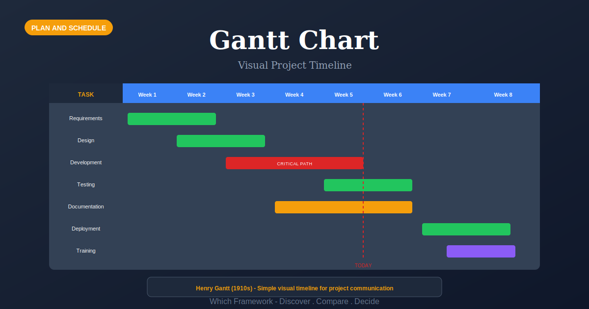
Gantt Chart is a schedule drawn as horizontal bars against a calendar, where each bar’s position gives a task’s start and finish, its length gives the duration, and arrows between bars show which tasks depend on which.
Before you start
Is this your framework?
A Gantt chart does one job well: it shows a schedule to people who need to see it, including people who will never open the plan itself. That is not a small thing. Most scheduling artifacts are unreadable to anyone outside the project, and this one is readable by almost everybody.
What it is not is a calculator. It displays a schedule; it does not work one out. The dependencies, durations and float have to come from somewhere else, and a chart drawn without them is a picture of what somebody hopes will happen.
| If your real problem is… | You probably want |
|---|---|
| We need to know which tasks actually control the finish date | Critical Path Method — the calculation behind the picture. A Gantt displays a critical path; it does not find one Compare Gantt Chart and Critical Path Method |
| We have not yet worked out what all the tasks are | Work Breakdown Structure — the decomposition that supplies the rows before any bar can be drawn Compare Gantt Chart and WBS |
| Scope emerges as we go and the plan is rewritten every fortnight | Sprint Planning or Kanban — short horizons and flow rather than a long dated plan |
| Durations are genuinely uncertain rather than merely unknown to us | PERT — three estimates per task and a probability for the finish date |
| We need to know who is responsible for each piece of work | RACI Matrix — responsibility, which a bar chart says nothing about |
| We need to see and limit work in progress rather than plan dates | Kanban — flow and WIP limits, for work that arrives continuously |
| We have a worked-out schedule and people need to see and track it | Gantt Chart — you are in the right place |
What Is It?
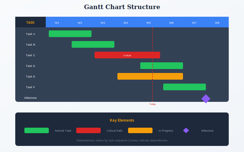
Tasks run down the left, time runs across the top, and every task is drawn as a bar. Where the bar starts is when the work starts; how long it is, is how long the work takes; where it ends is the finish. That is the whole idea, and it has survived a century largely unchanged because almost anyone can read it without being taught.
Three things get added to that base. Dependencies are arrows between bars, showing which task has to finish before another can begin. Milestones are diamonds marking a dated event with no duration, such as a handover or an approval. Progress is shading inside a bar showing how much is done, usually read against a vertical line marking today.
The most useful thing to understand about a Gantt chart is what it is downstream of. It is a presentation layer. The rows come from a breakdown of scope, the durations come from estimates, and the sequence and float come from a network calculation. Modern software hides all of that, which is convenient and occasionally misleading: a tool will happily draw a beautiful chart from dates typed straight in, with no logic behind any of them.
Software has also blurred the vocabulary. Many products call this a timeline view or a Gantt view, and use the terms interchangeably. In ordinary usage they are not interchangeable, and the next-but-one section sets out the difference.
A Gantt chart normally sits after Work Breakdown Structure and Critical Path Method, which supply its rows and its logic.
Quick Reference
Reading it
How to read one
Six elements, and each one answers a different question. The third column matters most: some of what a chart shows is fact, and some is somebody’s estimate drawn to look like fact.
| Element | What it tells you | How solid is it |
|---|---|---|
| Bar position | When a task is scheduled to start and finish. | Only as solid as the logic behind it. A date typed in directly looks identical to one calculated. |
| Bar length | Duration — how long the work takes, not how much effort it needs. A two-week task may be two days of work. | An estimate. Length is the commonest place optimism hides. |
| Arrows | Dependencies: which task must finish before another begins. This is what makes the chart a schedule rather than a set of dated bars. | Usually the most reliable element, because a dependency is a fact about the work. |
| Diamonds | Milestones: a dated event with no duration. Approvals, handovers, go-live. | Solid when externally fixed, soft when the team chose the date. |
| Shading in a bar | Progress. Compared against the today line, it shows whether a task is ahead or behind. | Frequently self-reported, and the least reliable number on the chart. |
| Highlighted bars | The critical path: the chain with no float, where any delay moves the end date. | Only meaningful if a network was actually calculated. Color alone proves nothing. |
Constraints, and when they start lying
Most tools let you pin a task with a constraint — Start No Earlier Than, Finish No Later Than, Must Start On. Used for genuine external fixtures, a permit date or a delivery slot, these are exactly right.
Used to make a plan look acceptable, they quietly break it. A constraint overrides the dependency logic, so the chart stops recalculating when something slips and keeps showing the date somebody wanted. The tell is a schedule that never moves while the work plainly does. If bars are not shifting when predecessors run late, check the constraints before believing the finish date.
Terminology
Why a Gantt is not a timeline
The two words are used interchangeably, particularly by software, and they describe different artifacts. The distinction is easy to state and worth holding, because reaching for the wrong one wastes effort.
| Artifact | What it shows | Duration? | Dependencies? |
|---|---|---|---|
| Timeline | Events at points on a date axis: launches, deadlines, decisions. Good for a narrative or a roadmap. | No — events are points | No |
| Gantt chart | Work as bars with length, linked by dependencies, usually with progress against today. | Yes | Yes |
| Network diagram | Activities and dependencies as a graph, with no calendar. Where float and the critical path are computed. | Yes, as numbers | Yes, and it is the point |
| Roadmap | Intent over broad periods — quarters or themes — deliberately without dates precise enough to be missed. | Loosely | No |
The test, and why it matters practically
If nothing on your chart has a length, and nothing has a predecessor, you have a timeline. That is not a criticism; a timeline is often the right thing to show an executive audience. It is only a problem when it is called a schedule, because a timeline cannot tell you what happens when something slips.
The practical consequence follows from that. Slip a bar on a real Gantt chart and everything downstream of it moves, which is the whole reason for the arrows. Slip an event on a timeline and nothing else changes, because nothing is connected. Teams that plan on a timeline discover the knock-on effects one at a time, in the order they arrive.
Core Features
- Bars against a calendar: position gives dates, length gives duration
- Dependency arrows: four types, of which finish-to-start covers most work
- Milestones: dated events with no duration, drawn as diamonds
- Progress shading: completion read against a today line
- Critical path highlighting: the zero-float chain, when one has been calculated
- Universally readable: understood without training, which is its real advantage
Worked example
A tram extension, and the chart that never moved
An illustrative composite. A municipal tram extension in Nantes, France, budgeted at around €62 million over three years. The program board received a one-page Gantt chart every month. For eleven months the finish date on it did not change, which the board read as good news.
| Where they looked | What they found |
|---|---|
| The constraints | Fourteen tasks carried Must Start On constraints, added over two years whenever a date became inconvenient. The schedule had stopped recalculating. Slipping a predecessor no longer moved anything downstream, because the successors were pinned. |
| The arrows | Of 240 tasks, 61 had no predecessor at all. Their dates had been typed in. On the chart they were indistinguishable from calculated bars. |
| The board chart | The monthly one-pager showed 18 summary bars and no arrows whatsoever. It was, in effect, a timeline. Nothing on it could show a knock-on effect, so none was ever visible to the board. |
| The progress | Percent complete was self-reported by package leads. Three packages sat at 90% for over four months, a pattern common enough to have a name. |
| What changed | Constraints removed except for four genuine external fixtures. Logic added to the 61 orphaned tasks. The board chart redrawn with arrows on the summary bars. The finish date moved out by seven months at the first recalculation. |
A schedule that never moves is not a stable one
Eleven months of an unchanged finish date should have been the alarm, not the reassurance. Real projects absorb variation constantly, and a live schedule shows it: bars shift, float is consumed, the end date breathes. A date that sits perfectly still for a year is usually a date that has been prevented from moving, and the mechanism is almost always constraints.
The board chart was the second failure and the more common one. Summary bars without arrows are a timeline, whatever the tool calls them, and a timeline cannot display a consequence. The board was not being deceived; it was being shown an artifact structurally incapable of carrying the information it needed. Adding arrows to eighteen bars was a morning’s work.
When to Use
- A schedule exists and people outside the project need to see it
- Work has known tasks, durations and a sequence that will mostly hold
- Dependencies matter, so knock-on effects need to be visible
- Progress has to be tracked against a plan over months
- Construction, engineering, events, migrations, regulated delivery
- Reporting to a board or client who will not open a scheduling tool
When NOT to Use
- Scope emerges through delivery, so the chart is rewritten every sprint
- Work arrives continuously rather than as a project with an end
- The tasks are not yet known, which is a decomposition problem first
- It would be built without dependencies, producing a timeline labeled a schedule
- Nobody will maintain it, in which case it misleads from about week three
In practice
How Gantt charts go wrong
The chart is easy to produce and hard to keep honest, and every failure below makes it look healthier than the project is.
| Failure mode | What it looks like | What to do instead |
|---|---|---|
| Bars with no logic | Dates typed straight in, no predecessors, drawn identically to calculated bars | Check how many tasks have no predecessor. Anything above a handful is a picture, not a plan. |
| Constraints hiding slippage | A finish date that has not moved in months while the work plainly has | Remove every constraint that is not a genuine external fixture, then recalculate. |
| Arrows dropped for the summary | A board one-pager of bars with no dependencies, which cannot show a consequence | Keep arrows on summary bars. If they will not fit, the summary is too detailed. |
| The ninety percent task | Self-reported progress that reaches 90% quickly and stays there for months | Track completed deliverables rather than percentages, or use zero and a hundred only. |
| Too many rows | Six hundred bars nobody can read, updated by one person who has stopped believing it | Chart at the level the audience decides at. Detail belongs in the tool, not the report. |
| Confusing duration with effort | A three-week bar read as three weeks of work, so resourcing is planned wrongly | State effort separately. A bar shows elapsed time and nothing about intensity. |
Sourced
Evidence, and how to cite it
Henry Gantt developed and published the chart between about 1910 and 1915.
Gantt was an American mechanical engineer and management consultant who had worked with Frederick Taylor at Midvale and Bethlehem Steel. His bar charts appeared in Work, Wages, and Profits in 1910 and in later articles, and were used during the First World War to schedule munitions production. Wallace Clark’s 1922 book explaining the technique in English did much of the work of spreading it.
Gantt, H.L. (1910) Work, Wages, and Profits; Clark, W. (1922) The Gantt Chart: A Working Tool of Management. New York: Ronald Press.
A very similar chart existed fourteen years earlier, in Poland.
Karol Adamiecki, a Polish engineer, devised what he called the harmonogram in 1896 and described it to the Society of Russian Engineers in 1903. It combined time, sequence and coordination, and was arguably closer to a workflow network than to a simple bar chart, anticipating ideas that later appeared in critical path scheduling. He published in Polish in 1909 and more widely in 1931. The chart carries Gantt’s name largely because Gantt wrote in English and Adamiecki did not.
Adamiecki, K. (1931) ‘Harmonograf’, published in Polish and Russian; described publicly to the Society of Russian Engineers, 1903.
Gantt is a surname, not an acronym.
The word is frequently written in capitals, which leads people to look for an expansion that does not exist. It is simply the name of Henry Laurence Gantt (1861–1919). Written correctly it takes one capital letter, as in Gantt chart, in the same way as a Venn diagram or a Pareto chart.
Gantt, H.L. (1861–1919), American mechanical engineer.
How to cite it.
Harvard: Gantt, H.L. (1910) Work, Wages, and Profits. New York: Engineering Magazine Co.
APA: Gantt, H. L. (1910). Work, wages, and profits. Engineering Magazine Co.
For the technique’s spread, cite Clark, W. (1922) The Gantt Chart: A Working Tool of Management. For the earlier Polish work, cite Adamiecki and the harmonogram.
Key Strengths
- Readable by anyone: no training needed, which no other schedule artifact manages
- Shows consequence: arrows make knock-on effects visible when something slips
- Tracks against plan: progress and the today line in one view
- Universally supported: every scheduling tool produces one
- Good for reporting: the artifact boards and clients actually look at
Key Weaknesses
- Displays, does not calculate: the logic has to come from elsewhere
- Hides its own weakness: typed dates look identical to computed ones
- Constraints can freeze it: a pinned schedule stops telling the truth
- Brittle under change: heavy to maintain where scope moves often
- Says nothing about resources: two parallel bars may need the same person
Sequencing
What to run before and after
A Gantt chart is the last step of planning and the first step of reporting. Both of the things it needs come from somewhere else.
Before
Get the tasks, then get the logic
Decomposition supplies the rows and a network calculation supplies the sequence and the float. Skip either and the chart becomes a drawing of dates rather than a schedule.
During
Add uncertainty, ownership and resource reality
Bars carry a single duration and no owner, and two parallel bars may need the same crane. Handle risk, responsibility and capacity alongside the chart rather than inside it.
After
Report from it, and keep recalculating
Record actuals on a fixed cadence and let the schedule move. If the finish date has not shifted in months, check the constraints before treating that as good news.
Common questions
Gantt charts: quick answers
What is a Gantt chart?
A schedule drawn as horizontal bars against a calendar. Tasks are listed down the side, time runs across the top, and each bar shows when a task starts, how long it lasts and when it ends. Arrows between bars show which tasks must finish before others can begin.
What is the difference between a Gantt chart and a timeline?
A timeline places events at points on a date axis. A Gantt chart shows work as bars with length, so it carries duration, and it links those bars with dependencies. Duration and dependency are the two things a timeline does not have. If nothing on your chart has a length or a predecessor, what you have is a timeline.
How do you read a Gantt chart?
Read left to right. Bar position gives the start date, bar length gives the duration, and the right-hand end gives the finish. Shading inside a bar shows progress. Arrows show dependencies, so a bar cannot move left past whatever feeds it. A vertical line usually marks today, and diamonds mark milestones, which have a date but no duration.
What is a Gantt view in project software?
The name most tools give to the bar-chart view of a schedule, as distinct from a list, board or calendar view. Asana, Jira, Monday and similar products often call it a timeline view instead. The underlying artifact is the same: tasks as bars against dates, usually with dependency links.
What are the four types of task dependency?
Finish-to-start, where one task must finish before the next begins, which covers most cases. Start-to-start, where two tasks must begin together. Finish-to-finish, where they must end together. Start-to-finish, where one cannot end until another has started, which is rare. Most scheduling tools support all four.
What is a constraint in a Gantt chart?
A rule fixing when a task may run, independent of its dependencies. Typical ones are Start No Earlier Than, Finish No Later Than and Must Start On. Constraints are useful for genuine external fixtures such as a permit date or a delivery slot, and harmful when used to force a plan to look acceptable, because they override the logic the schedule is built from.
Can you use a Gantt chart for agile or sprint work?
Partly. A Gantt chart assumes the work is known and sequenced in advance, which sprint planning does not. Teams that need both usually chart the fixed external commitments and release dates, and leave sprint contents out of it. Charting individual stories across future sprints produces a plan that is rewritten every two weeks.
Who invented the Gantt chart?
Henry Gantt, an American mechanical engineer, developed and published his version between about 1910 and 1915. A very similar chart existed earlier: the Polish engineer Karol Adamiecki devised the harmonogram in 1896 and described it publicly in 1903. Adamiecki published in Polish and Russian, Gantt in English, which is largely why the chart carries Gantt's name.
Deep Resources
Frameworks related to Gantt Chart
- Critical Path Method (CPM)The calculation behind the picture: dependencies, float and the chain that sets the date…
- Work Breakdown Structure (WBS)The decomposition that supplies the rows before any bar can be drawn…
- PERTThree-point estimation where durations are genuinely uncertain…