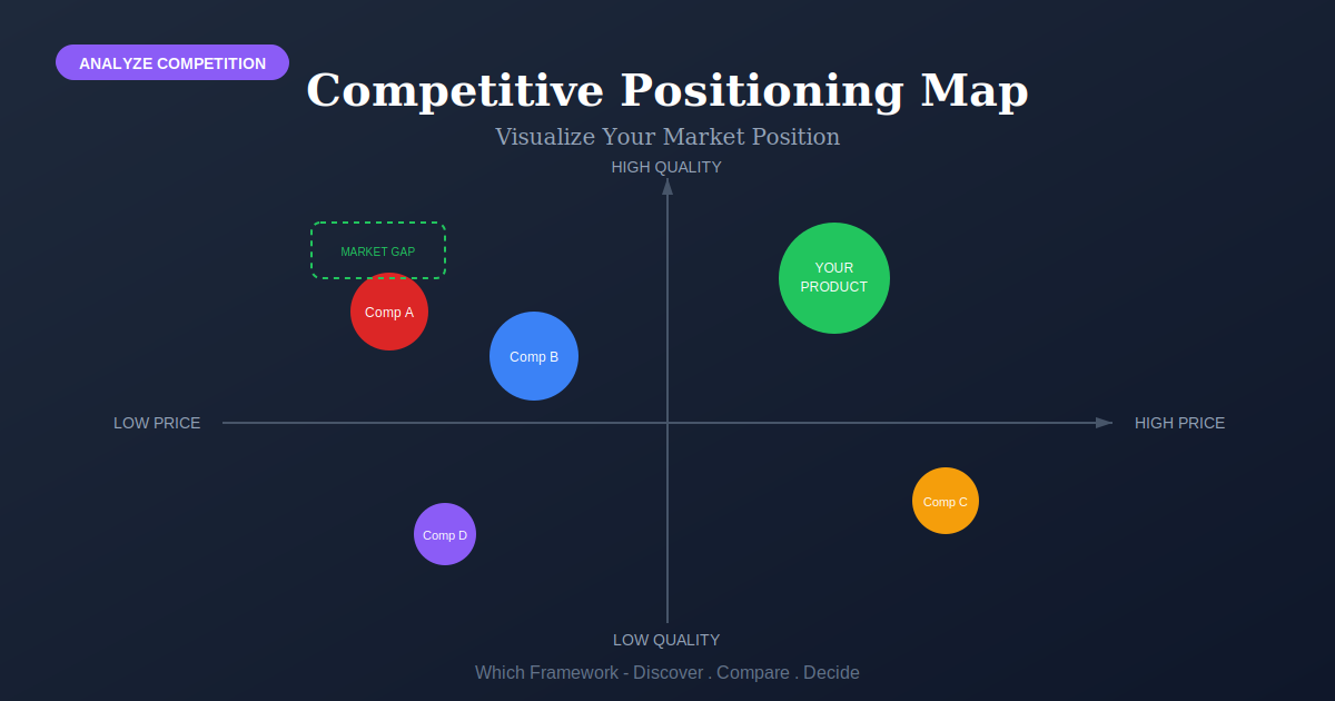
Competitive Positioning Map: How to Build and Read One
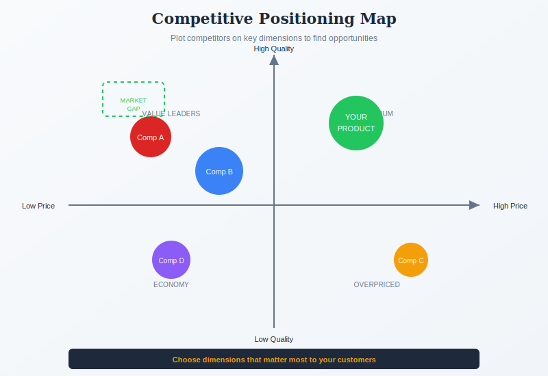
Competitive Positioning Map is a two-axis chart that plots the competing firms in a market on dimensions that separate them, each drawn as a bubble sized by market share, showing where the market is crowded and where it is unoccupied.
Before you start
Is this your framework?
A positioning map answers one question: who is standing where, and who is standing next to us? It is a picture of structure, drawn in an afternoon, and its value is that a room can argue with a picture in a way it cannot argue with a spreadsheet.
What it does not do is tell you why. It shows that three firms cluster together; it says nothing about whether that cluster is profitable, why the space beside it is empty, or what would happen if you moved. Those are separate questions with separate tools, and treating the map as the answer to them is the usual way it misleads.
| If your real problem is… | You probably want |
|---|---|
| We need to know whether this market is worth competing in, and where profit sits | Porter’s Five Forces — structure and profitability, which a map shows the shape of but never explains Compare Positioning Map and Five Forces |
| We need to decide on what basis we intend to compete | Porter’s Generic Strategies — choosing a position, where the map only describes the ones already taken Compare Positioning Map and Generic Strategies |
| We want to leave the comparison behind and build an uncontested space | Blue Ocean Strategy — its strategy canvas plots many factors, not two |
| We need to choose which segments to serve and how to address them | STP Framework — segmentation and targeting, which the map assumes you have already done |
| We need to know what customers are actually trying to achieve | Jobs to Be Done — demand rather than supply, and a much better source of candidate axes |
| We need a full internal and external picture for a planning cycle | SWOT Analysis — broader and shallower, and it includes your own capabilities |
| We need to see the shape of the market and who we sit next to | Competitive Positioning Map — you are in the right place |
What Is It?
Take two dimensions on which the firms in a market differ. Draw them as axes. Plot every firm as a bubble, sized by market share, at the point matching its choices on both dimensions. That picture is a positioning map, and it is one of the few strategy tools that can be built in an afternoon and still change a conversation.
What it produces is structure. Firms rarely scatter evenly; they gather into clusters, because similar strategies tend to work in similar conditions. Those clusters tell you who your real competitors are, which is often a shorter list than the industry. A firm in a different cluster may share your industry classification and compete with you barely at all.
The map also shows regions where nobody sits. This is where it is most often misread. An unoccupied region is a question, not an answer. Space can be empty because customers do not want that combination, because it cannot be made to pay, or because getting there from where the existing firms sit costs more than it returns.
One naming note, since the same picture travels under several names. In marketing, a map built from customer survey data about perceptions is a perceptual map. In strategy, a map built from firms’ observable choices is a strategic group map. Most maps drawn in practice are neither, being built from the team’s judgment, which is fine as long as everyone knows that is what is on the wall. The evidence section sets out where each comes from.
The map pairs naturally with Porter’s Five Forces for the structure behind the picture, and with Porter’s Generic Strategies for deciding which position to hold.
Quick Reference
The method
How to build one
Five steps, of which the second decides whether the map is worth drawing at all. Everything else is bookkeeping.
| Step | What it requires | The test |
|---|---|---|
| 1. Define the market | Decide who belongs on the chart before you draw anything. A market defined too widely produces a scatter with no structure; defined too narrowly, it leaves out the firm about to take your customers. | Would a customer of yours seriously consider every firm on this map? |
| 2. Choose two axes | Dimensions that vary independently. This is where most maps die. Price and quality are the usual pick and the usual mistake, because price signals quality, so the two axes measure one variable and every firm lands on a diagonal. | Can you name a real firm that is high on one axis and low on the other? |
| 3. Gather the evidence | The same kind of evidence for every firm: published prices, product counts, channel lists, service terms. Where you are guessing, mark it, because a map that mixes measured and guessed positions hides which is which. | Could a competitor check your placement of them and agree? |
| 4. Plot and size | Each firm as a bubble, sized by market share or revenue. Size carries the information that position alone cannot: a firm sitting beside you with ten times your share is a different problem from one with a tenth. | Does the picture change if you cover the bubble sizes? |
| 5. Read the clusters | Look at groups, not dots. Who sits together, how big each group is, and what separates one group from the next. Then treat every empty region as a question about why it is empty. | Can you say what it would cost to move from one cluster to another? |
The axis test, in one question
Before you commit to a pair of axes, ask: can you name a real firm that is high on one and low on the other? If you cannot, the two dimensions are the same dimension wearing different labels, and your map will be a diagonal line dressed up as analysis.
Good axis pairs come from choices firms have genuinely made differently: breadth of range, sales channel, geographic scope, degree of customization, service level, how much of the value chain they own. Those are decisions, and decisions vary. Adjectives like “quality” and “innovation” feel like axes but usually turn out to be summaries of everything else, which is why they correlate with price.
Core Features
- Two axes: dimensions on which the firms in a market genuinely differ
- Bubbles sized by share: position and scale in one picture
- Clusters, not dots: the groups are the finding
- Unoccupied regions: raised as questions rather than treated as gaps
- Fast and disposable: built in hours, redrawn whenever the axes are wrong
- Argument-ready: a picture a room can disagree with specifically
Worked example
A gin distillery, and the map that was a straight line
An illustrative composite. A craft gin distillery in Hampshire, England, with about £6 million in revenue, stuck in the middle of a category that had roughly quadrupled in size over a decade. The board wanted to know where to take the brand.
| Step | What it produced |
|---|---|
| The first map | Price against quality, fourteen brands. Every one landed on a diagonal running from cheap-and-ordinary to expensive-and-admired. The map was a straight line, and the meeting concluded that the brand should be “more premium”, which nobody could act on. |
| The diagnosis | In gin, price is the main quality signal, so the two axes were measuring one thing. Nobody in the room could name a brand that was expensive and poorly regarded, or cheap and admired, which is the test the axes had failed. |
| The second map | New axes, both drawn from choices distillers actually make differently: how conventional the botanicals are, and whether the product is built for mixing or for drinking neat. Brands that had sat on top of each other now spread across the chart. |
| What it showed | A dense cluster of eleven brands at conventional-and-for-mixing, and a thinly occupied region at experimental-and-for-sipping holding two small brands. Bubble sizes made the point sharper: the crowded cluster held about 80% of category volume. |
| What they did | Moved toward the thin region over two years, with a sipping-strength expression and a change in how the botanicals were described. |
Two things the second map still did not tell them
The thin region was thin partly for a reason. Gin is overwhelmingly a mixed-drink category, so the sipping occasion is genuinely small. The move worked, but it bought margin rather than volume: revenue grew slowly while gross margin rose by nine points. Had they read the empty space as pure opportunity and moved the whole business there, they would have taken a good position in a market too small to hold them.
And their own placement turned out to be wrong. A customer survey run afterwards put the brand much nearer the conventional cluster than the team had plotted it, because the botanicals the distillers considered adventurous were not perceived that way by drinkers. The strategic map showed the choices they had made; a perceptual map showed what those choices had communicated. The gap between the two was the actual finding, and it took a survey rather than a workshop to see it.
When to Use
- Early in a competitive review, to establish who is actually in the market
- Entering a new market and needing to see its shape quickly
- The team disagrees about who the real competitors are
- Preparing a board or investor discussion that needs one clear picture
- Before a deeper study, to decide which questions are worth the money
- After a repositioning, to check whether anything actually moved
When NOT to Use
- The decision needs to rest on measured customer perception, not judgment
- More than two dimensions genuinely matter and none can be dropped
- The market has no settled boundary, so who belongs on the chart is the argument
- You need to know why a position is profitable rather than who holds it
- The output would be used to justify a decision already taken
In practice
How positioning maps go wrong
The tool is cheap, which is its virtue and the source of most of its failures. Nothing about drawing one forces you to be right.
| Failure mode | What it looks like | What to do instead |
|---|---|---|
| Correlated axes | Price against quality, and every firm on a diagonal, which reads as insight and contains none | Apply the test: name a firm high on one axis and low on the other, or change the axes. |
| Empty space read as opportunity | A dashed box in the corner labeled “market gap” and a strategy built on it | Ask why it is empty. Unprofitable, unwanted, or unreachable are all likelier than unnoticed. |
| Flattering self-placement | Your own bubble in the best spot on the chart, placed by the people who built the product | Have someone outside the team place you, or test the placement with customers. |
| Convenient omissions | The awkward low-price entrant left off because it “is not really a competitor” | Include anyone your customers consider. Their view of the market decides, not yours. |
| Position without scale | Equal-sized dots, so a firm with 30% share looks like one with 2% | Size the bubbles. Share changes what a neighboring position means entirely. |
| Drawn once, believed for years | A map from a strategy offsite still quoted after the market has moved around it | Redraw whenever a significant entrant, exit or repricing happens. |
Sourced
Evidence, and how to cite it
The formal version in strategy is the strategic group map.
Michael Hunt introduced strategic groups in a 1972 Harvard doctoral dissertation on the US home appliance industry, observing that firms in one industry cluster around different recipes for competing. Richard Caves and Michael Porter developed the related idea of mobility barriers in 1977, and Porter set the approach out for a general readership in Competitive Strategy in 1980. His argument was that firms in the same group face similar pressures, which makes the group, rather than the industry, the right unit for thinking about rivalry.
Hunt, M.S. (1972) Competition in the Major Home Appliance Industry 1960–1970. Doctoral dissertation, Harvard University; Porter, M.E. (1980) Competitive Strategy. New York: Free Press, ch. 7.
A perceptual map and a strategic group map are different instruments.
A perceptual map plots how customers perceive firms, and its data comes from survey research on attributes such as innovative or traditional. A strategic group map plots the choices firms have made, and its data is observable from outside: prices, product counts, channels, scope. One measures what buyers believe, the other what companies do. They frequently disagree, and that disagreement — a firm whose choices place it in one group while customers place it in another — is usually the most useful thing either map produces.
Contrast drawn in the strategic groups literature; see Porter (1980), ch. 7, and the marketing literature on perceptual mapping.
Empty regions are explained by mobility barriers, not by oversight.
Porter’s account of strategic groups includes mobility barriers: the costs and structural obstacles that make moving from one group to another slow or expensive. Capital requirements, brand equity built over decades, distribution contracts and regulatory licences all keep firms where they are. This is the reason to treat an unoccupied region on a map as a question. Sometimes nobody has thought of it. More often, the firms best placed to reach it have worked out what it would cost them.
Caves, R.E. & Porter, M.E. (1977) ‘From entry barriers to mobility barriers’, Quarterly Journal of Economics, 91(2); Porter (1980), ch. 7.
How to cite it.
There is no single founding paper, because the tool has separate roots in marketing and in strategy. For the strategic group version — Harvard: Porter, M.E. (1980) Competitive Strategy: Techniques for Analyzing Industries and Competitors. New York: Free Press, ch. 7.
APA: Porter, M. E. (1980). Competitive strategy: Techniques for analyzing industries and competitors. Free Press.
For the origin of strategic groups, cite Hunt (1972). For mobility barriers, cite Caves and Porter (1977).
Key Strengths
- Fast: a first version takes an afternoon, and a wrong one is cheap to redraw
- Argument-ready: a room can disagree with a picture precisely
- Narrows the competitor list: shows who you actually compete with
- Carries scale: bubble sizes put position and share in one view
- Works at any size: a two-person startup and a multinational draw the same chart
Key Weaknesses
- Only two dimensions: markets that differ in five ways cannot be drawn
- The axes decide the answer: choose badly and the map shows nothing
- Usually judgment, not data: the placements are opinions unless measured
- Descriptive only: shows what is, never why, and never what to do
- Invites false gaps: empty space reads as opportunity to almost everyone
Sequencing
What to run before and after
A positioning map is a fast opening move. Its output is a set of questions, and the frameworks on either side are what answer them.
Before
Settle the market boundary and find candidate axes
You cannot plot a market you have not defined. Segmentation tells you whose view of the market counts, and understanding what customers are hiring the product to do produces far better axes than a whiteboard does.
During
Explain the structure the picture shows
The map shows clusters and empty space. Industry analysis explains why the clusters are where they are, which is what turns a description into a reason to act or to stay put.
After
Choose a position, or leave the map behind
Knowing where everyone stands is not a strategy. Either commit to a basis of competition and the refusals that come with it, or stop comparing on the industry’s existing dimensions altogether.
Common questions
Competitive positioning maps: quick answers
What is a competitive positioning map?
A chart with two axes on which you plot yourself and your competitors, usually with each firm drawn as a bubble sized by market share. The axes are dimensions that separate the players in the market. Reading it shows where the market is crowded, which firms compete most directly with each other, and which regions nobody occupies.
How do you make a positioning map?
Define the market first, so it is clear who belongs on the chart. Pick two dimensions that genuinely vary independently. Gather comparable evidence for every firm on both dimensions. Plot each one, sizing the bubbles by market share. Then read the clusters rather than the individual dots, because the clusters are what the map is for.
What axes should I use on a positioning map?
Two that vary independently. The commonest choice, price against quality, is usually the worst one, because price signals quality in most markets, so every firm lands on a diagonal and the map shows nothing. Better pairs come from choices firms actually make differently: breadth of range, channel, geographic scope, service level, or how customized the offer is.
Does an empty space on the map mean a market gap?
Not by itself. A region can be empty because it is unprofitable, because no customer wants that combination, or because barriers make it too costly to reach from where the existing firms sit. Porter called those mobility barriers. An empty space is a question worth investigating, not an opportunity already found.
What is the difference between a positioning map and a perceptual map?
What the axes measure. A perceptual map plots how customers perceive each firm, and the data comes from survey research. A positioning or strategic group map plots the strategic choices firms have actually made, and the data is observable from the outside. The two often disagree, and that disagreement is usually worth investigating on its own.
What is a strategic group map?
The formal version of this tool in strategy. Firms are clustered by the strategic choices they share, and the map shows those clusters and the barriers to moving between them. The idea came from Michael Hunt's 1972 doctoral dissertation on the US home appliance industry, and Michael Porter popularized it in Competitive Strategy in 1980.
How many competitors should I plot?
Enough to show the structure of the market and few enough to read, which in practice is usually between five and twelve. Include the market leaders, your closest rivals, and at least one firm you think is doing something different. Leaving out an awkward competitor is the quickest way to produce a map that flatters you.
How do I cite a competitive positioning map?
There is no single founding paper, because the tool has separate roots in marketing and in strategy. For the strategic group version, Harvard style: Porter, M.E. (1980) Competitive Strategy: Techniques for Analyzing Industries and Competitors. New York: Free Press, ch. 7. APA style: Porter, M. E. (1980). Competitive strategy: Techniques for analyzing industries and competitors. Free Press. For the origin of strategic groups, cite Hunt (1972).
Deep Resources
Frameworks related to Competitive Positioning Map
- Porter's Five ForcesIndustry structure across five competitive forces, explaining why clusters sit where they do…
- Porter's Generic StrategiesChoosing a basis of competition: cost leadership, differentiation or focus…
- Blue Ocean StrategyCreating uncontested space rather than positioning within the existing market…